%20(2).png)
7 min
SaaS Product Design Agency Pricing: What to Expect in 2026
What does SaaS product design agency pricing look like in 2026? Real US benchmarks for audits, redesigns and retainers, plus the costs quotes leave out.
Read More


Published
July 3, 2026
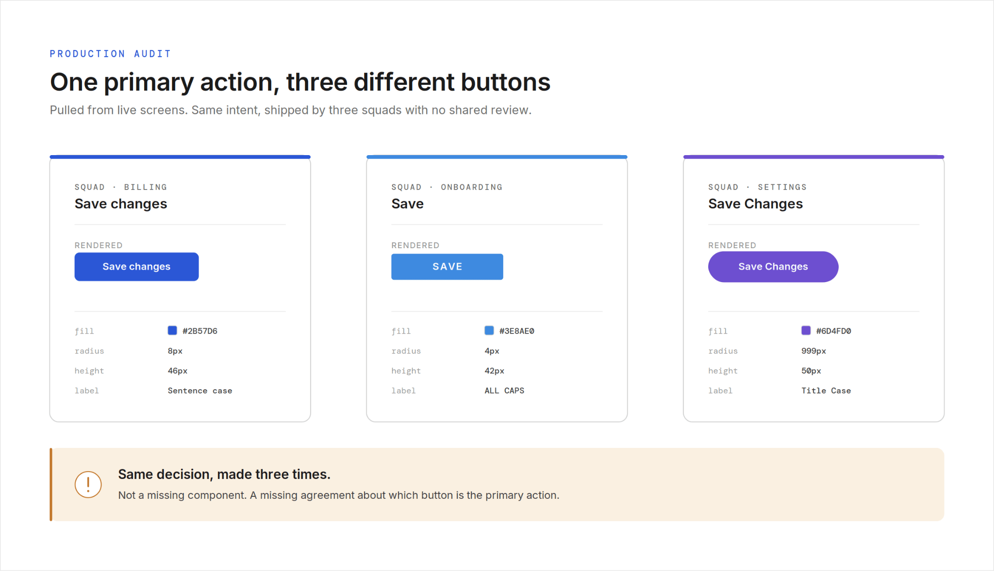
We have audited design systems for growing SaaS products, and the same pattern shows up every time. The buttons exist. The tokens exist. The documentation exists. On one large B2B platform we found three versions of the primary button, four settings page layouts, and several table patterns solving the same problem. The team did not have a component problem. They had a design system for SaaS that nobody was following.
When consistency breaks across a SaaS product, the instinct is to blame the library. Not enough components. Missing states. Outdated documentation. So the team commissions a bigger library, and six months later the product looks just as fragmented.
Here is what the audits actually show. The components are there. The tokens are there. People are simply not using them, or they are using three slightly different versions of the same thing.
A design system does not fail at the moment of creation. It fails at the moment of adoption.
Industry analyses of design system health describe the same decay. Components duplicate, tokens drift out of sync with code, and patterns fork every time a squad ships in parallel without a shared review.
A design system is not a delivery of components. It is an agreement about which decisions are already made.
This matters because the two problems have completely different fixes. A missing-component problem is solved by design work. An adoption problem is solved by governance, and most teams never staff for that.
So they keep building components nobody is required to use. The library grows, and the product fragments anyway. The gap between what the system says and what the product does widens until a new feature looks like it came from a different company.
Most people hear design system and picture a component library. A neat Figma file of buttons, inputs, and cards, with a documentation site attached.
That picture is the reason so many systems fail. A library is an inventory. It tells you what exists, and it says nothing about what people are allowed to do.
The more useful definition is narrower. A design system is the set of decisions a team has agreed to stop re-litigating.
Which button means a primary action. How a settings page is laid out. What a data table does when it has no rows.
Once a decision is in the system, no individual designer reopens it on a Tuesday because they prefer a different radius. That is the whole point. The system exists so that hundreds of small choices do not get made hundreds of different ways.
This reframe changes what you build. If a design system is an inventory, you measure it by how many components it has. If it is a set of decisions, you measure it by how often the product follows them.
The second number predicts whether your product feels like one product. A team with a thin library and high adoption ships something coherent. A team with a rich library and low adoption ships something that looks assembled by strangers.
A while back we worked with a large B2B SaaS platform that had outgrown its own interface. The people who felt it most were the Head of Product and a group of product managers watching their roadmap slow down.
The product had been built by autonomous squads shipping in parallel. Each squad moved fast, and none of them shared a review step for interface decisions.
The result was two design systems running at once. There were no standardized tokens and no single style guide.
Designers made calls independently, and the product reflected it. We counted three versions of the primary button, four settings page layouts, and several table patterns built to solve the same job.
Underneath all of it was a quieter problem. The component library lived in Figma but never made it into code. Designers handed off, engineers rebuilt from scratch, and the two drifted further apart with every release.
So we stopped trying to maintain multiple systems in parallel. That was the obvious approach, and it was the thing keeping the mess alive.
We started with an audit. We went through the existing systems, components, and live product screens and mapped every overlap, conflict, and gap. Only then did we consolidate everything into one approved system as the single source of truth.
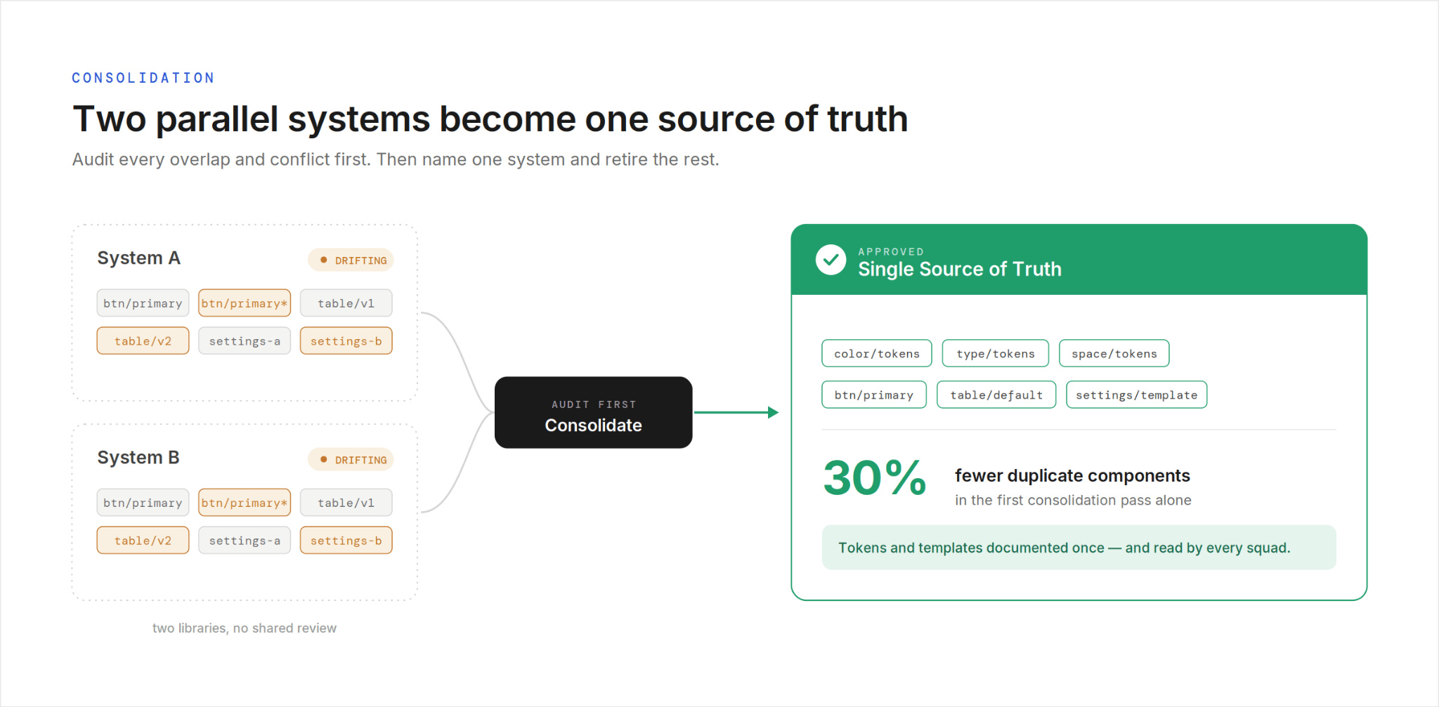
From there the work was concrete. We built standardized tokens for color, typography, and spacing.
We defined component specifications and finalized layout templates for the patterns squads kept rebuilding, settings pages and tables among them. We documented when each component should be used, not just what it looked like.
The change that mattered most was not visual. We replaced individual interpretation with a documented framework every designer could follow, and we put governance around adoption so new patterns stopped appearing by default. In the first consolidation pass alone, duplicate components dropped by 30%.
The lesson generalizes. Consistency is not a styling outcome. It is what happens when a team agrees, in writing, to make a decision once.
Before you design a single new component, map what already exists. Pull every live screen, every Figma library, and every one-off pattern, and lay them side by side. You will find duplicates, conflicts, and gaps you did not know were there. The audit is not busywork. It is how you avoid building system number three on top of systems one and two.
Two design systems is the same as none, because every designer gets to choose. Name one system as the source of truth and retire the others on a deadline. This decision is political before it is technical, so get the Head of Product to back it out loud. A source of truth that engineering and design do not both accept is just a fourth opinion.
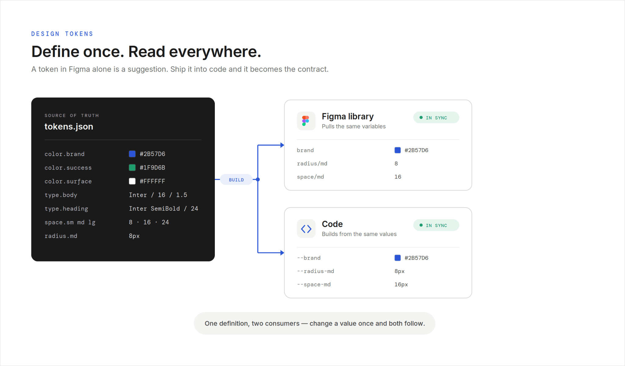
Design tokens for color, typography, and spacing are where consistency actually lives. A token that exists only in a Figma file is a suggestion engineers are free to ignore. Define the tokens once and ship them into code so design and build read from the same values. When the token is the contract, a color change is one update, not a hunt across forty screens.
Most fragmentation does not happen at the button level. It happens at the page level, where every squad invents its own settings page or table layout. Give teams finalized templates for the patterns they rebuild most often. A documented settings template removes a hundred small decisions before anyone opens Figma, and it is the fastest way to make two squads produce screens that match.
A component with no usage rules gets used three different ways within a month. For every pattern, write down when to reach for it and when not to. Which button is the primary action. When a table beats a list. What an empty state must include. The documentation that prevents drift is about decisions, not pixels, and it is the part most libraries skip.
A design system with no owner is a snapshot that goes stale the day you ship it. Assign someone to review new patterns, approve additions, and track adoption across teams. Governance is not bureaucracy. It is the difference between a system that holds for two years and one that forks the first time a squad is in a hurry.
The lesson is not specific to enterprise software. We saw the same dynamic on a D2C commerce growth platform built for fast iteration.
Speed was the whole culture there. Squads shipped landing pages, promotions, and checkout experiments weekly, and each one introduced small variations in buttons, spacing, and form styling.
Individually, none of it looked wrong. Together, the storefront started to feel slightly different from page to page.
The fix was the same shape as before. We did not slow the team down with a heavyweight process. We gave them a tight set of tokens and a few locked layout templates for the pages they rebuilt most, so a new promotion inherited the right styling by default instead of by memory.
The takeaway holds for every design system for SaaS we have audited. Fast-moving teams do not need fewer decisions. They need the repeated decisions made once and handed to them, so speed stops costing consistency.
Run the audit on your own product before you commission any new design work. Open your live screens side by side and count how many versions of your primary button are in production. The number is usually higher than anyone expects, and it is the clearest signal that your design system for SaaS is being ignored.
Then pick one source of truth, move your tokens into code, and template the two or three page layouts your squads rebuild most. Do that before you add a single new component.
Bottom line. A design system for SaaS does not break because it lacks components. It breaks because nothing makes hundreds of independent decisions resolve the same way. The teams that scale cleanly are the ones that decided once and wrote it down.
If your product is starting to look like it was built by different companies, that is the work our SaaS product design team does every week. Start with the audit, not another component.