Most agencies will send you a process deck with five tidy phases, a Gantt chart, and a kickoff call. It looks reassuring. It is also largely how design was done in 2018.
The tooling, the speed expectations, and the way products get validated have all shifted. At Fluidesigns, we have updated how we work to reflect that not because it is trendy, but because the old approach produces avoidable delays and misalignment for Series A/B teams who are moving fast.
This article breaks down what the modern SaaS design process actually looks like: where it diverges from convention, where it still follows it, and how AI has changed specific phases without replacing the thinking that matters.
One note before we start: we work across a variety of SaaS products, and the right process is never identical. What follows is how we think, not a checklist we force every client through.
01 Discovery and Research
Foundation
The discovery phase has not changed in principle you still need to understand the problem deeply before designing anything. What has changed is how much of this work can be compressed without losing quality.
A few years ago, distilling research from stakeholder interviews, call recordings, and competitive teardowns into a coherent product brief took two to three weeks. Today, AI tools let us process far more raw material in a fraction of that time. Patterns surface faster. The synthesis is sharper.
We are careful about how we use this. We work only with information that clients explicitly share with us for design purposes, and we always treat AI outputs as starting points for human review not finished conclusions. The goal is speed on the mechanical side organizing themes, spotting gaps, drafting frameworks so our team can spend more time on the interpretive work that actually drives design decisions.
Discovery typically produces: a jobs-to-be-done map, ICP personas, a competitive UX teardown, core user flows, and a product brief that ties design decisions to business outcomes. For GeoComply a fraud detection platform used by major US sportsbooks this upfront investment cut revision cycles in half downstream.
Key shift: Discovery is now significantly faster without losing depth. AI compresses synthesis; human judgment drives conclusions.
02 Information Architecture
Sometimes explicit, always present
Here is an honest admission: IA as a formal, standalone deliverable is not always the right investment. For products that are early-stage or changing quickly, producing a full sitemap and object model can create false confidence in a structure that will shift anyway.
What we do instead: embed IA thinking into the early prototyping phase. We make structural decisions explicit navigation hierarchy, role-based access, object relationships but we validate them through something tangible rather than a diagram that only designers can fully read.
That said, for products with real complexity multiple user roles, deep data models, enterprise admin layers we do invest in proper IA before prototyping. Voicegain, an AI speech analytics platform for enterprise contact centres, was a clear case. Four years of accumulated features had created fragmentation across three distinct user roles. We needed to model the full system before touching any screen. The resulting IA became the structural foundation for a complete redesign.
The signal: if your product has five or more distinct user roles, or if users are consistently lost in the existing navigation, treat IA as a phase. Otherwise, embed it.
03 Prototyping
Vibe prototyping has changed the game
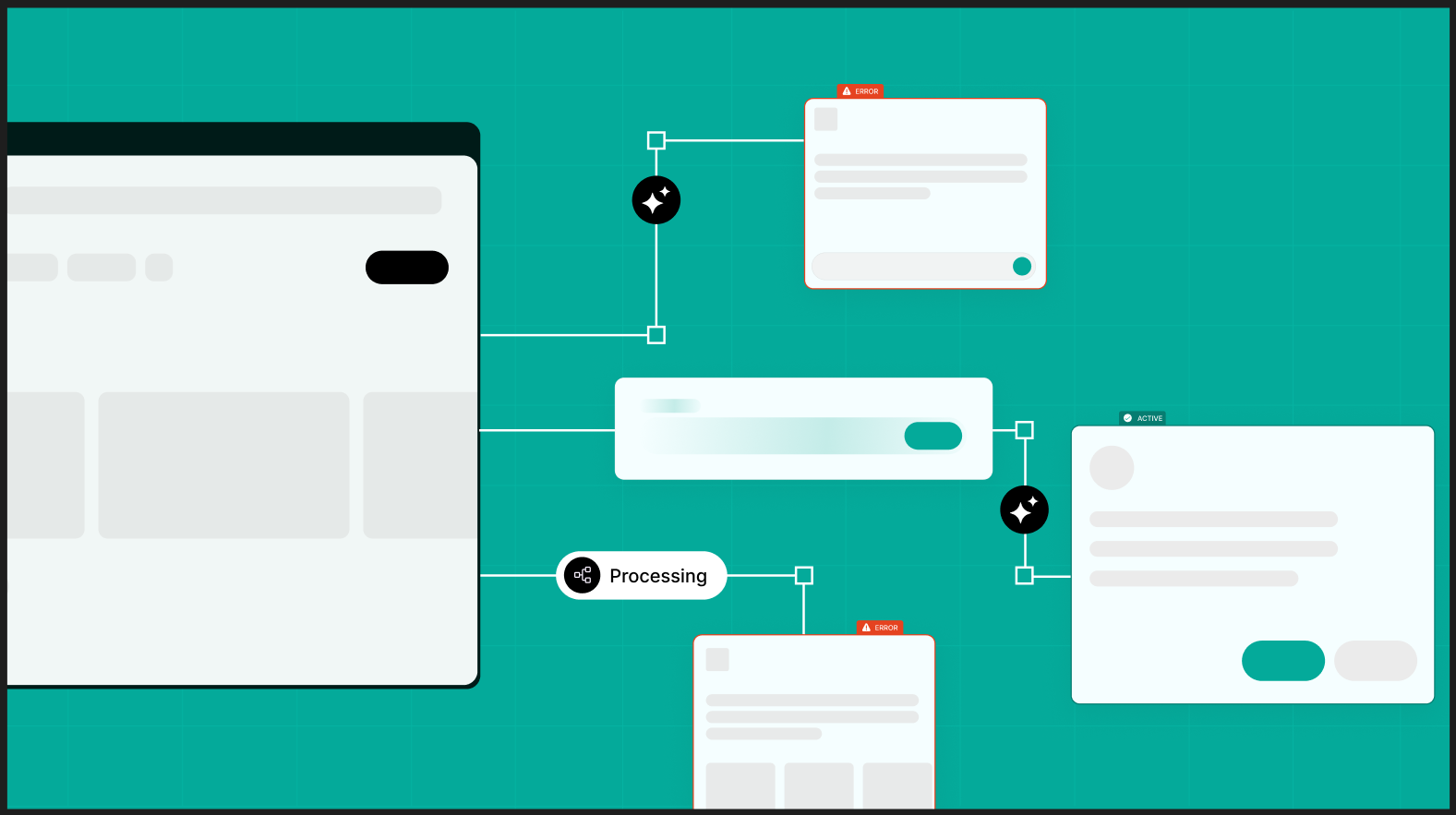
This is where the biggest shift has happened, and it is worth being specific about what changed and why.
The traditional approach: low-fidelity wireframes, then mid-fidelity annotated wireframes, then an interactive prototype, then stakeholder review. Each step added time and a layer of abstraction between what was designed and what the client could actually respond to.
We have moved most projects to what we call vibe prototyping using AI-assisted tools to generate high-fidelity, clickable prototypes far earlier in the process. Not polished final screens, but real enough that stakeholders can interact with them and give feedback that is grounded in experience, not imagination.
The practical benefit: alignment happens faster. Clients who struggled to read wireframes can navigate a prototype and immediately point to what is not working. That feedback, surfaced in week two instead of week six, saves significant rework.
We still wireframe when: the product has complex flows with heavy data requirements, when we need to model edge cases and error states in detail, or when a client needs annotated deliverables for a development team. Wireframing excels at precision documentation. Vibe prototyping excels at alignment and direction. Neither is always right we use both and are explicit with clients about which approach fits.
04 Usability Testing
Validate before you build, not after
Usability testing is the phase most teams skip when timelines get tight. It is also the phase that prevents the most expensive mistakes.
We run usability testing at the prototype stage before a single line of code is written. For Pebble Impact, a grant management platform for nonprofits, we ran structured sessions on mid-fidelity prototypes with real users before any visual design was finalized. Issues caught at this stage cost a fraction of what they cost to fix post-development.
What we test for: can users complete core tasks without guidance? Where do they hesitate or go wrong? Are the mental models in the design matching the mental models users actually bring to the product? These are not questions you can answer by looking at the design yourself.
Testing does not need to be a formal research project. Five to eight sessions with the right participants surfaces the majority of critical issues. The output is a prioritized list of friction points with recommended fixes not a 40-page report.
Remote moderated testing works well for SaaS products. We recruit from the client user base or from screened panels depending on what is available. Sessions are recorded, reviewed, and synthesized into actionable findings within a few days.
05 Visual Design and UI
Runs in parallel, not in sequence
The old model treated visual design as something you started after wireframes were approved. By the time it began, teams had lost energy and context from earlier phases. Feedback loops lengthened. And the visual layer often had to fight upstream decisions that had not accounted for how things would actually look.
We now run visual design and prototyping in parallel. Early prototypes carry real visual direction color, type, density, hierarchy rather than being wireframe-grey placeholders. Stakeholders react to something close to the real product from early on, and the visual design phase iterates rather than starting cold.
For B2B SaaS specifically, visual design does more work than most founders realize. A product UI communicates trust and competence before a user clicks anything. Buyers evaluate it. Investors notice it. Candidates assess it. Zinrelo, an AI-powered loyalty platform, came to us for a mobile app redesign. We built a component library with every interactive state documented and shipped hover, active, disabled, loading, error with near-zero design debt.
AI role in this phase: we use it to generate first-pass content for all interface states loading copy, error messages, tooltips, onboarding microcopy. Designs ship with real words rather than lorem ipsum, which changes how feedback lands and how development proceeds.
06 Design System
Earlier than you think
Most agencies position design systems as the final phase something you build after the product is fully designed. We have moved this earlier, and it changes the quality of everything downstream.
Starting design system foundations before visual design is complete forces useful decisions early. What are the color tokens? What are the spacing rules? What interactive states are we committing to? Answering these early means the visual design phase produces consistent, reusable components rather than one-off screens that have to be reconciled later.
We have built design systems from the ground up for Gokwik, Geocomply and konfirmity. Every system starts with foundations: typography scale, semantic color tokens, spacing system, elevation model, and motion principles. Components follow: atoms to molecules to organisms, with usage documentation that developers can actually read.
The ROI is concrete. Teams with mature design systems ship new features significantly faster. Designers stop rebuilding components from scratch. Developers stop asking which shade of gray. For Series A/B teams trying to move fast without accumulating debt, a design system built at the right time is one of the best investments they can make.
07 Scaling, Data, and Iteration
Post-launch is not a handoff
The design process does not end at launch. For most of our SaaS clients, that is when the most important work begins.
After a product ships, the question shifts from "does this design make sense?" to "how are real users actually behaving?" This is where tools like Hotjar, LogRocket, FullStory, and Mixpanel become part of the design conversation. Heatmaps show where users click and where they do not. Session recordings surface hesitation, confusion, and workarounds that no prototype session would have caught. Funnel data identifies where users drop before completing a key action.
We review this data with clients on a regular cadence typically monthly or quarterly and use it to build a prioritized list of design tweaks. Not every finding requires a redesign. Most are targeted fixes: a CTA that is not prominent enough, a form asking for information at the wrong moment, a nav item users consistently miss. Small changes with measurable impact.
Products designed only for today user base rarely scale gracefully. New user roles appear. Enterprise clients need admin controls that were not scoped. Features that worked at 10 clients break the navigation at 100. Konfirmity, a compliance management platform, reached us after growing from 10 to 200 enterprise clients. Their original design could not handle admin controls at scale. We redesigned the admin layer with a centralized control surface that served both SMB and enterprise segments without rebuilding the core product.
We build scaling considerations into every engagement from day one: navigation structures that can absorb new features without collapsing, dashboard layouts that work at small and large data volumes, component systems that support white-labeling if needed. These decisions are cheap to make upfront and expensive to retrofit.
Process as a variable, not a constant
The honest answer to "what is your process?" is: it depends on your product, your team, your timeline, and what phase of growth you are in.
What does not change: you need rigorous discovery before any design work. Structure and visual language should be validated early. Real user testing before development prevents expensive rebuilds. Design systems are infrastructure, not polish. And post-launch data should feed directly back into design decisions.
What has changed: the tools are faster, the validation loop is tighter, and the expectation from founders is that design should produce real results quickly not just beautiful screens.
If that is the kind of agency you are looking for, we should talk.


.png)
.png)
