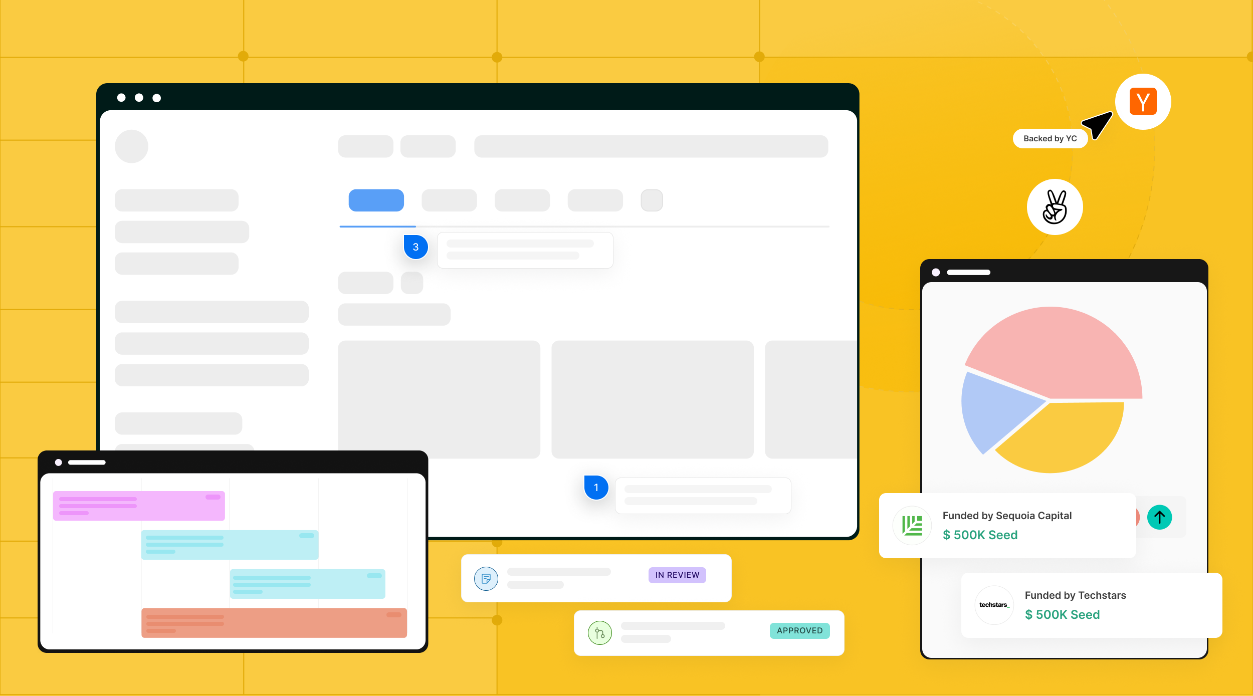
Why SaaS Startups Fail Without Good UX Design (And How to Fix It)
Thank you for subscribing !
Thank you! Your submission has been received!
Oops! Something went wrong while submitting the form.
Tags
Bad design
SaaS
UX Design
90% of startups fail (Startup Genome / CB Insights). The usual suspects get blamed: bad timing, weak distribution, underfunding. But one factor keeps showing up in the data and rarely makes the post-mortem: SaaS UX design. Not aesthetics. Not color palettes. The structural design decisions that determine whether a paying user becomes a retained customer or a churn statistic within 90 days.
UX Is Not a Post-PMF Luxury. It Is the PMF Signal.
Most funded SaaS teams treat design as something you invest in after product-market fit is proven. Ship fast, validate demand, then polish the interface. That sequencing sounds logical. The data says it is backwards.
Forrester Research found that every dollar invested in UX returns $100 (Forrester via Adobe). McKinsey's Design Index study tracked 300 publicly listed companies over five years and found that top-quartile design performers saw 32 percentage points higher revenue growth and 56 percentage points higher total returns to shareholders compared to their industry peers.
UX is not what you do after users love your product. UX is why they love it or leave it.
The financial cost is concrete. When a user churns within 90 days because the product felt too complex, every dollar spent acquiring that user evaporates. And according to Bain & Company research published in HBR, increasing customer retention by just 5% can boost profits by 25% to 95%. In SaaS, where the entire business model depends on retention, design is not a cost center. It is the revenue lever most teams ignore.
The UX-Revenue Connection
Data from verified primary sources
ROI on every $1 in UXForrester
$100 return
Revenue growth: design-led vs peersMcKinsey
+32 percentage points
Profit boost from 5% retention gainBain & Co. / HBR
Redefining "Good UX" for SaaS: It Is Not About Screens
When founders hear "UX," most picture pixel-perfect dashboards or trendy UI animations. That mental model is wrong, and it is expensive.
Good SaaS UX design is decision architecture. It is the structural logic that determines whether a user can complete their core task smoothly or gets lost in a maze of menus and settings. Whether the dashboard surfaces the one metric they need or buries it under twelve tabs. Whether the upgrade path is obvious or requires a support ticket.
The core principle comes from information architecture research: when a product's structure matches how users actually think about their workflow (what IA researchers call "mental model alignment"), users find features faster, file fewer support tickets, and discover more of the product. When the product is organized around internal engineering logic instead, users get lost. The ROI is not in making screens prettier. It is in reducing the perceived effort required to get value from the product.
The Post-Signup Churn Math Most Teams Ignore
SaaS teams obsess over acquisition metrics: CAC, MQLs, trial signups. But the real revenue destruction happens after signup, in the first 90 days.
The average activation rate for SaaS products is just 37.5% (AgileGrowthLabs, 2025). Two-thirds of new users never experience the core value of the product they signed up for. 75% abandon within the first week (UserGuiding). For B2B SaaS companies serving SMBs, 43% of all customer losses happen within the first 90 days (Loyalty.cx).
These users already decided to try your product. They signed up. They had intent. The product lost them. And given what Bain's research shows about the profit impact of even small retention improvements, the compound cost of these early losses over 12 months is staggering.
Where Users Drop Off Post-Signup
Average SaaS product user journey in the first 90 days
100%Sign up
All new signups
37.5%Activate
62.5% never reach core value
25%Survive Week 1
75% gone by end of week 1
~14%Retained at Day 90
43% of losses happen in first 90 days
43% of all customer losses
happen in the first 90 days for B2B SaaS companies serving SMBs
These are not aesthetic preferences. Each fix addresses a specific failure point in the post-signup user journey. Any SaaS founder or product leader can brief a designer on these and see impact within one quarter.
1. Fix Dashboard Cognitive Overload
The most common dashboard problem in B2B SaaS is not missing data. It is too much data shown at once with no visual hierarchy. When every chart, metric, and table competes for attention, users cannot answer the most basic question: "What should I do next?"
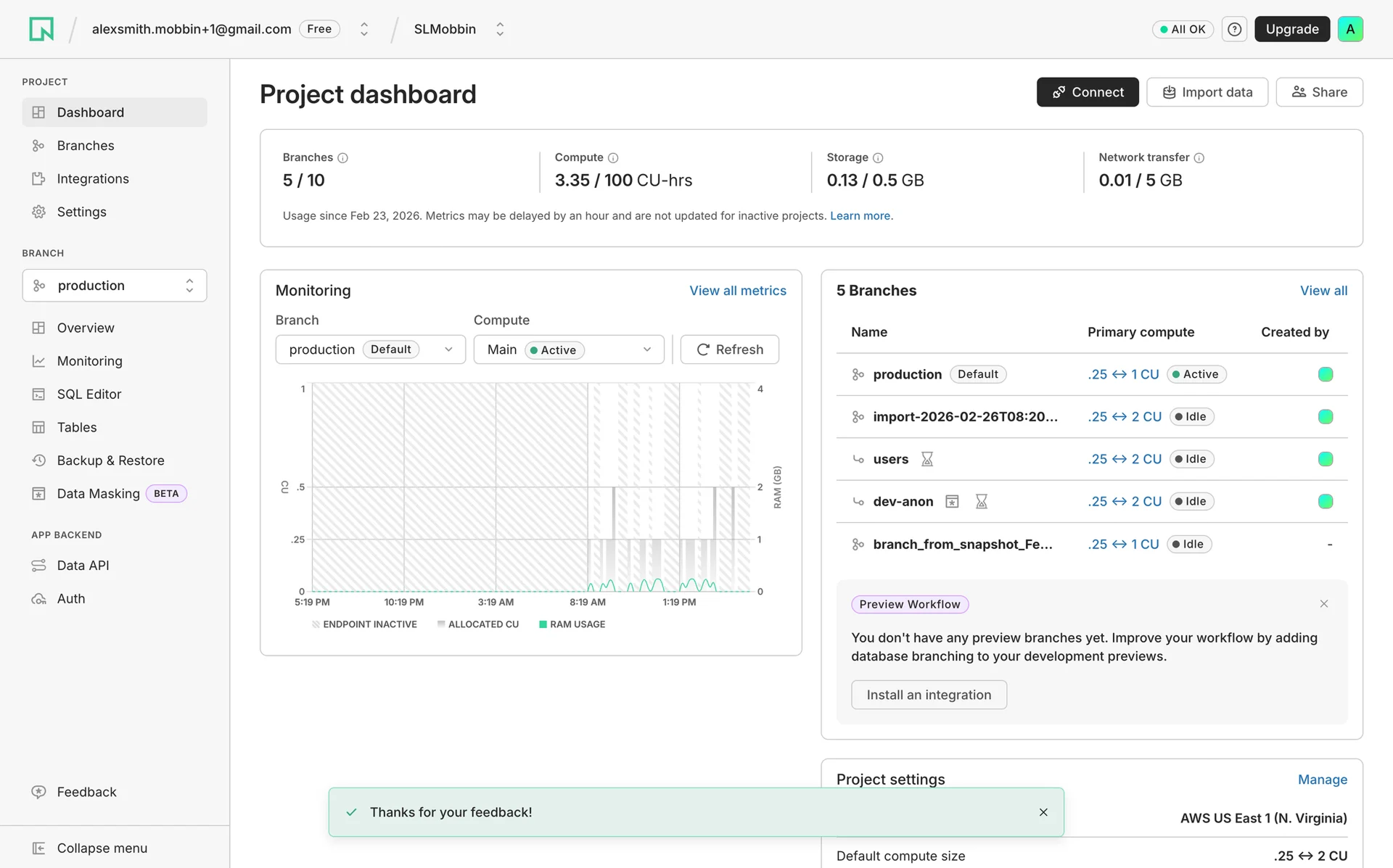
The fix is progressive disclosure: surface the three to five metrics that matter for each user role, and tuck everything else behind intentional navigation. Neon does this well. Their project dashboard opens with usage limits (branches, compute, storage) as top-level cards, then layers in monitoring charts and branch details below. Every element traces back to a specific decision: "Am I within limits?" and "Is my database healthy?"
Stripe learned this at scale. By 2022, years of decentralized development had left their merchant dashboard fragmented across 1.4 million users. After the dashboard team unified the experience with a shared design system and simplified the information architecture, the improvements helped close over $10 million in new SaaS partnerships within three months, partly driven by the accessibility improvements that came with the redesign.
Neon SaaS dashboard progressive disclosure
2. Design Empty States That Drive Action
When a new user signs into your SaaS product for the first time and sees a blank screen with no data, no guidance, and no clear next step, you have already lost them. Empty states are one of the most overlooked UX failures in SaaS, and they hit hardest at the exact moment when user motivation is highest.
The fix: treat every empty state as a mini-onboarding moment. Fibery nails this. Instead of dropping users into a blank workspace, they show a clear heading ("Let's Get You Started"), explain the current state, and offer a single prominent CTA ("Create your first workspace"). GitBook takes a similar approach: "Create your first site" with a brief description of what happens next.
Personalized onboarding paths increase Day 30 retention by 52% versus generic flows (Loyalty.cx). The pattern is consistent: show users what their product will look like with data, give them one clear action, and explain what they gain from completing it.
Gitbook and Fibery SaaS Empty state design
3. Reduce Perceived Effort in Core Workflows
The old UX heuristic of "count the clicks and cut them" misses the point. A ten-step wizard that feels effortless because each step is simple and obvious will outperform a three-step form that overwhelms users with 15 fields on a single screen. What matters is not the number of interactions. It is whether each interaction feels like progress or friction.
The effortless experience model (from Dixon, Toman, and DeLisi's book The Effortless Experience) frames this clearly: lowering perceived effort improves loyalty more than delighting with extras. In practice, this means pre-filling fields where you already have data, breaking complex flows into focused steps, and making sure each screen answers "what do I do here?" without requiring the user to think.
One SaaS platform improved registration completion from 23% to 67% (a 191% lift) by breaking a dense single-page form into a guided multi-step flow (SaaSFactor). More steps. Less perceived effort. Better results.
4. Clarify the Upgrade and Expansion Path
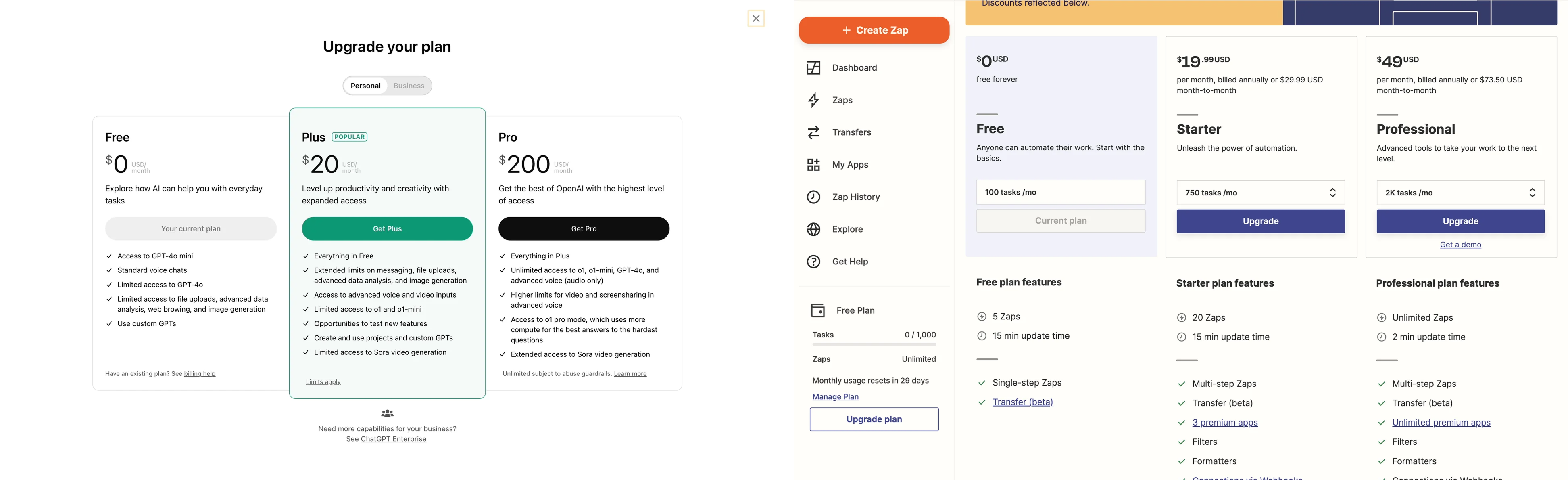
If a user cannot quickly understand what they get by upgrading, they will not convert. The most common upgrade UX failures are well-documented: more than three or four pricing tiers creates choice paralysis, vague plan names ("Pro" vs "Business" vs "Enterprise") without clear differentiation confuse users, and upgrade prompts that appear before the user has experienced enough value feel pushy rather than helpful.
ChatGPT's upgrade modal is a strong reference: three tiers, clear price anchoring, a "POPULAR" badge on the middle tier, and each plan described in one sentence of value (not a feature checklist). Zapier shows another smart pattern: usage-based anchoring ("100 tasks/mo" vs "750 tasks/mo") that makes the upgrade trigger quantifiable. The user can see exactly when they will outgrow their current plan.
Chatgpt and Zapier Pricing Page UX
5. Simplify Settings and Configuration
Complex settings screens are where SaaS products lose their most engaged users. Power users who want to customize, integrate, and configure are your best expansion revenue candidates. When the settings experience is confusing, those users file support tickets instead of self-serving, and your customer success cost per account rises.
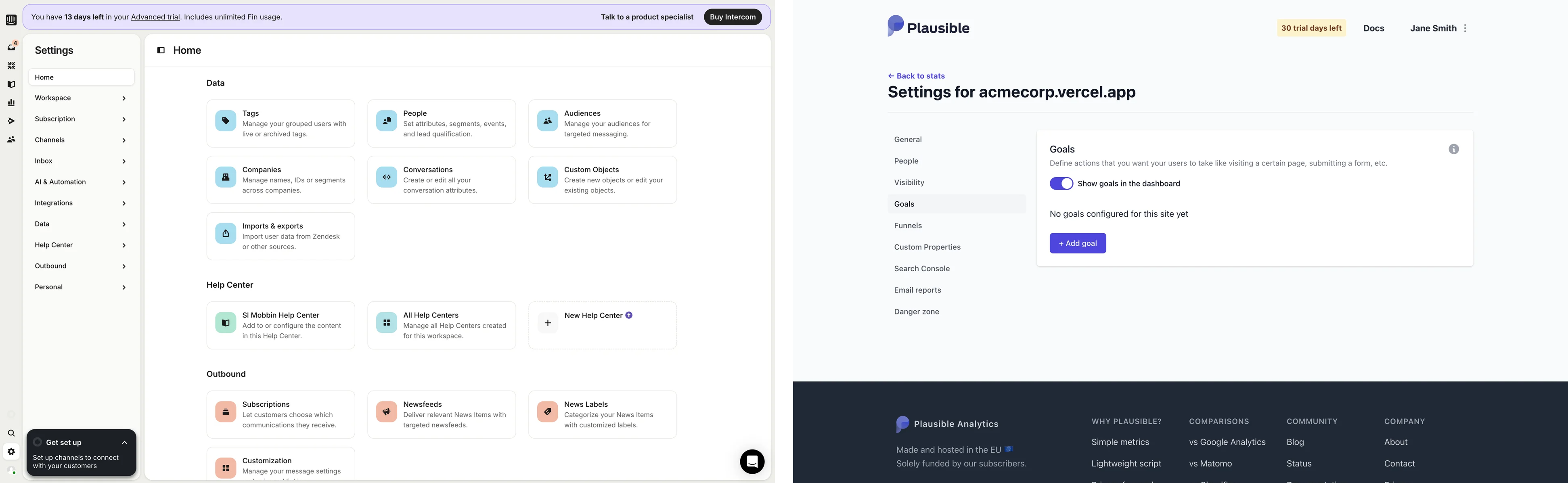
Intercom's settings page is a reference example. Instead of a flat list of system labels, they organize settings into goal-oriented cards grouped by category ("Data," "Help Center," "Outbound") with one-line descriptions of what each section does. A user looking to import contacts does not scan for "Imports & exports." They scan for "Import user data from Zendesk or other sources" and click. The framing is by user goal, not system function.
Plausible Analytics takes a simpler approach: clean left-nav categories (General, People, Visibility, Goals, Funnels) with each section loading a focused panel. No overwhelming mega-page. The principle is the same: group by what the user is trying to accomplish, not by how the engineering team organized the codebase.
Intercom and Plausible Analytics Settings UX Design
The Compound Cost of Ignoring SaaS UX Design
Design-driven companies outperform the S&P 500 by 228% over a 10-year period (Design Management Institute). McKinsey's research shows 32 percentage points more revenue growth for top-quartile design companies. Bain's research shows that even a 5% retention improvement can nearly double profits.
These are not edge cases. They are the baseline math of what happens when design is treated as a cost center versus a growth lever. For funded SaaS startups burning through runway, the question is not whether to invest in SaaS product design. It is whether you can afford the compound cost of not investing.
Where to Start: A Practical Sequence
If your SaaS product has a churn problem and you are not sure whether UX is the cause, start here. Audit your three most-used workflows and map where users drop off or file support tickets. Check your activation rate: if it is below 40%, the product experience is likely the bottleneck, not your marketing. Review your dashboard: can a new user answer "What should I do next?" within 10 seconds of logging in? If not, you have a hierarchy problem.
The fixes outlined above are not theoretical. They are the same structural UX decisions that separate SaaS products with 90%+ gross retention from those bleeding users every quarter.
Why SaaS Startups Fail Without Good UX Design (And How to Fix It)
90% of startups fail. The usual suspects get blamed: bad timing, weak distribution, underfunding. But one factor keeps showing up in the data and rarely makes the post-mortem: SaaS UX design.
fix saas onboarding drop offs ux
Fix SaaS onboarding drop-offs by reducing setup steps, highlighting the primary user action, and delivering value within the first 5–10 minutes. High-performing onboarding flows use progress indicators, contextual guidance, and early success milestones to increase activation rates. Analyze drop-off points with product analytics, remove unnecessary friction, and optimize each onboarding step based on user behavior data.
common ux mistakes saas conversion rates
Common UX mistakes that reduce SaaS conversion rates include complex signup forms, unclear value propositions, excessive onboarding steps, poor mobile usability, and weak call-to-action design. These issues increase user friction and abandonment rates. Improve SaaS conversion rates by simplifying workflows, clarifying product benefits, reducing form fields, and guiding users toward a single primary action.
SaaS startups fail without good UX design
SaaS startups can fail without good UX design because poor UX increases churn, lowers activation rates, and reduces customer retention. Users abandon SaaS products when onboarding feels confusing, workflows take too long, or the interface hides core value. Strong UX design improves adoption by making the product faster, clearer, and easier to use.
Why do most SaaS startups fail even after having a great product?
Most SaaS startups fail despite having a great product because they fail to achieve product-market fit, acquire customers efficiently, or retain users consistently. Strong products do not guarantee growth. Poor UX, weak onboarding, ineffective positioning, high customer acquisition costs, and low retention rates often prevent sustainable revenue growth. Successful SaaS companies combine a strong product with effective distribution, customer success, and user experience.
Cities we cater SaaS Product Design Services in United States: SaaS Product Design Services in Pittsburgh, SaaS Product Design Services in Pennsylvania, SaaS Product Design Services in Kansas City, SaaS Product Design Services in Missouri, SaaS Product Design Services in Lancaster, SaaS Product Design Services in Pennsylvania, SaaS Product Design Services in Hartford, SaaS Product Design Services in Connecticut, SaaS Product Design Services in Knoxville, SaaS Product Design Services in Tennessee, SaaS Product Design Services in Knoxville, SaaS Product Design Services in Tennessee, SaaS Product Design Services in Harrisburg, SaaS Product Design Services in Pennsylvania, SaaS Product Design Services in Manchester, SaaS Product Design Services in New Hampshire, SaaS Product Design Services in Jacksonville, SaaS Product Design Services in Florida, SaaS Product Design Services in Lansing, SaaS Product Design Services in Michigan, SaaS Product Design Services in Fort Wayne, SaaS Product Design Services in Indiana, SaaS Product Design Services in Cincinnati, SaaS Product Design Services in Ohio, SaaS Product Design Services in Indianapolis, SaaS Product Design Services in Indiana, SaaS Product Design Services in Pensacola, SaaS Product Design Services in Florida, SaaS Product Design Services in San Diego, SaaS Product Design Services in California, SaaS Product Design Services in Fort Myers, SaaS Product Design Services in Florida, SaaS Product Design Services in San Antonio, SaaS Product Design Services in Texas, SaaS Product Design Services in Reno, SaaS Product Design Services in Nevada, SaaS Product Design Services in Omaha, SaaS Product Design Services in Nebraska, SaaS Product Design Services in Winston-Salem, SaaS Product Design Services in North Carolina, SaaS Product Design Services in Houston, SaaS Product Design Services in Texas, SaaS Product Design Services in Lexington-Fayette, SaaS Product Design Services in Kentucky, SaaS Product Design Services in Albany, SaaS Product Design Services in New York, SaaS Product Design Services in Boston, SaaS Product Design Services in Massachusetts, SaaS Product Design Services in Phoenix, SaaS Product Design Services in Arizona, SaaS Product Design Services in Phoenix, SaaS Product Design Services in Arizona, SaaS Product Design Services in Salt Lake City, SaaS Product Design Services in Utah, SaaS Product Design Services in Portland, SaaS Product Design Services in Maine, SaaS Product Design Services in Greenville, SaaS Product Design Services in South Carolina, SaaS Product Design Services in Dallas-Fort Worth, SaaS Product Design Services in Texas, SaaS Product Design Services in Charlotte, SaaS Product Design Services in North Carolina, SaaS Product Design Services in Washington, DC, SaaS Product Design Services in Sarasota, SaaS Product Design Services in Florida, SaaS Product Design Services in Boise, SaaS Product Design Services in Idaho, SaaS Product Design Services in Asheville, SaaS Product Design Services in North Carolina, SaaS Product Design Services in Nashville, SaaS Product Design Services in Tennessee, SaaS Product Design Services in San Jose, SaaS Product Design Services in California, SaaS Product Design Services in Grand Rapids, SaaS Product Design Services in Michigan, SaaS Product Design Services in Madison, SaaS Product Design Services in Wisconsin, SaaS Product Design Services in Huntsville, SaaS Product Design Services in Alabama, SaaS Product Design Services in Raleigh, SaaS Product Design Services in Durham, SaaS Product Design Services in North Carolina, SaaS Product Design Services in Seattle, SaaS Product Design Services in Washington, SaaS Product Design Services in Portland, SaaS Product Design Services in Oregon, SaaS Product Design Services in San Francisco, SaaS Product Design Services in California, SaaS Product Design Services in Minneapolis-St. Paul, SaaS Product Design Services in Minnesota, SaaS Product Design Services in Des Moines, SaaS Product Design Services in Iowa, SaaS Product Design Services in Fayetteville, SaaS Product Design Services in Arkansas, SaaS Product Design Services in Colorado Springs, SaaS Product Design Services in Colorado, SaaS Product Design Services in Denver, SaaS Product Design Services in Colorado, SaaS Product Design Services in Austin, SaaS Product Design Services in Texas
Global SaaS UI/UX Design Agency in United States
Q: What is the main argument of this article?
A: The article argues that UX is not a cosmetic afterthought but a core driver of retention and revenue for SaaS startups. Poor UX causes high post-signup churn, and investing in structural UX decisions (information architecture, onboarding, dashboard hierarchy, upgrade paths, and settings UX) delivers outsized ROI and protects recurring revenue.
Q: How can improving UX reduce SaaS churn in the first 90 days?
A: Improving UX addresses the common failure points that cause early churn: unclear dashboards, blank/unguided empty states, high perceived effort in core workflows, confusing upgrade paths, and complex settings. Fixes such as progressive disclosure, action-driving empty states, guided multi-step flows, clear pricing tiers, and goal-oriented settings help more users reach core value and increase Day 30–90 retention.
Q: What measurable ROI can design changes deliver for SaaS companies?
A: The article cites industry studies showing large returns: Forrester observed up to $100 return per $1 invested in UX, McKinsey found top design performers saw 32 percentage points higher revenue growth, and Bain reported that a 5% retention gain can boost profits 25%–95%. While individual results vary, targeted UX improvements often yield fast activation and retention gains within a quarter.
Q: We’re pre-product-market fit — should we invest in UX now or wait?
A: The article recommends prioritizing UX earlier than many teams assume. Rather than waiting for perfect PMF, invest in decision architecture and the core workflows that show value quickly. Early UX alignment with users' mental models helps prove PMF by increasing activation and retention, rather than being a post-PMF luxury.
Q: How long does it take to see impact from the recommended UX fixes?
A: The piece suggests that focused, structural UX changes (dashboard hierarchy, empty-state onboarding, streamlined core flows, clearer upgrade paths, and simplified settings) can show measurable impact within one quarter. Some teams report conversion or activation lifts within weeks after deploying guided flows and improved onboarding.
Q: What does Fluidesigns offer and how do they approach SaaS UX problems?
A: Fluidesigns is a SaaS product design agency that works with funded SaaS and AI startups to fix churn and activation issues through evidence-based UX changes. Their practical approach begins with auditing the most-used workflows, mapping dropoff and support ticket patterns, and then prioritizing fixes that reduce perceived effort and improve activation and retention.
Q: How do you measure whether UX work is the real bottleneck versus marketing or acquisition?
A: Start by checking activation and early retention metrics: if activation is below ~40%, it’s likely the product experience is the bottleneck. Auditing three high-usage workflows and support ticket patterns reveals where users drop off. Improvements in activation rate, Day 30 retention, and reduction in support tickets are primary signals that UX changes solved the problem.
Related searches: Design agency USA, Web design agency in USA, Product design company, Medical product design companies, Lollipop agency, Lollypop design Studio Mumbai, Top product design agency for startups in usa, Free product design agency for startups in usa, Best product design agency for startups in usa, Lollypop design studio salary, Product Design Studio, design studio salary for freshers, UI/UX design agency USA, Design agency in USA


.png)