SaaS Dashboard UX Design: 5 Decisions That Actually Matter
Thank you for subscribing !
Thank you! Your submission has been received!
Oops! Something went wrong while submitting the form.
Tags
SaaS
UX Design
User Behaviour
Design Principles
A SaaS founder came to us with a clear request: their dashboard needed more charts. Users were complaining it felt incomplete. The product team added a revenue graph, a funnel visualization, a cohort table, and a usage heatmap. Engagement with the dashboard dropped further.
The problem was never the number of charts. Nobody in the product had decided which metric mattered most. So every number on the screen looked equally important, which meant nothing was important. Users opened the dashboard and had no idea where to look first.
That is not a data problem. That is a SaaS dashboard UX design problem. After auditing 20 dashboards across fintech, analytics, HR, CRM, and developer tools, the same failure appeared repeatedly.
Your Dashboard Has an Information Hierarchy Problem, Not a Data Problem
Most conversations about SaaS dashboard design focus on chart selection. Which visualization type is right for this metric? Should this be a bar chart or a line chart? These are real questions, but they are not the first question.
The first question is: what does the user need to know the moment they open this screen? If your team cannot answer that in one sentence, the dashboard is not ready to be designed. Adding more charts to an undefined hierarchy does not solve the problem. It amplifies it.
Across the 20 dashboards in this audit, the ones that worked had one thing in common. They made a decision about what mattered most, and they designed the entire screen around surfacing that thing first. Everything else was subordinate.
The dashboards that frustrated users were the ones where every metric had the same visual weight. No primary number. No clear starting point. Users had to construct their own picture from scratch every single time they logged in.
A Dashboard Is Not a Data Library. It Is a Decision Support Tool.
The mental model most product teams use when building dashboards is wrong. They think of a dashboard as a place to display all the data the product has access to. Complete coverage feels like the goal.
A dashboard that a user actually returns to every day is built around a different question: what decision does this person need to make, and what is the minimum information they need to make it confidently?
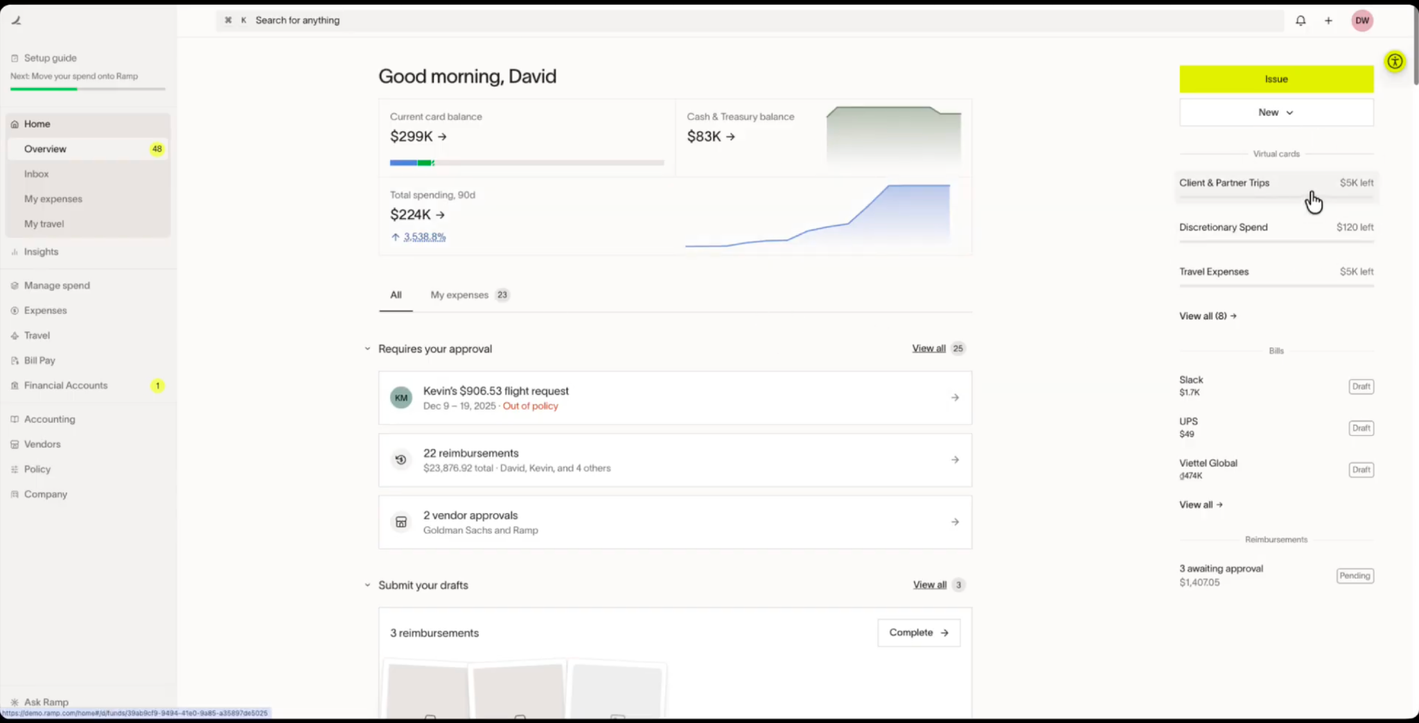
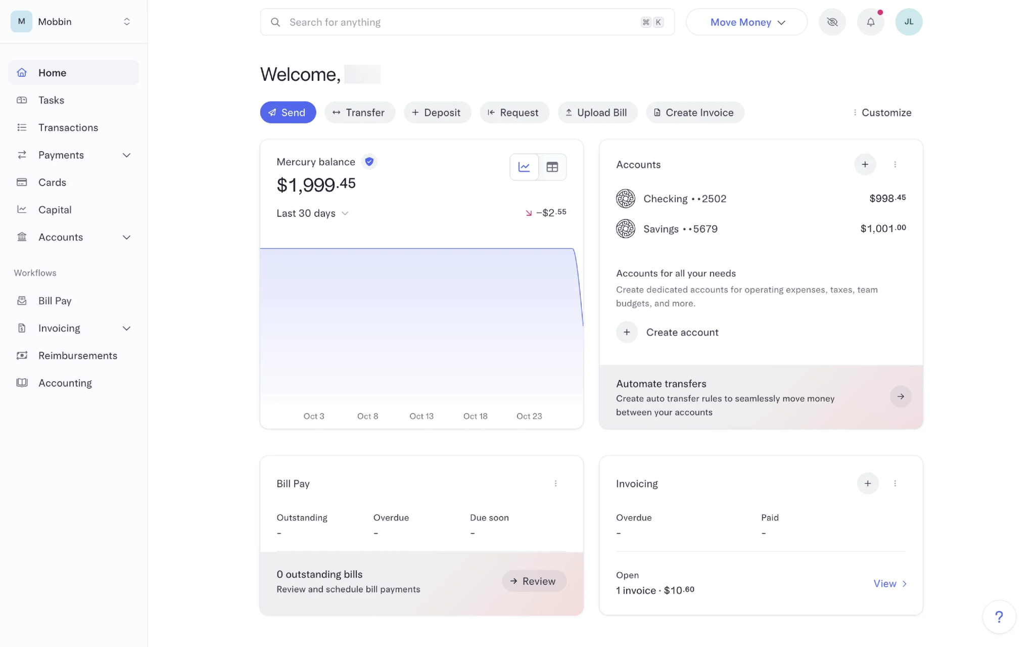
Ramp does not show every financial metric available. It surfaces the approvals that need attention, the reimbursements that are pending, and the policy violations that need resolution. The dashboard tells users what to do, not just what happened. Mercury does the same for banking: the most common actions are placed directly below the welcome message before any data appears at all.
That shift from data library to decision support tool is the core reframe. Once a product team makes it, every design decision that follows becomes clearer.
What 20 SaaS Dashboards Revealed About What Actually Works
We audited 20 dashboards across fintech, analytics, CRM, HR, developer tools, and AI products. For each, we documented how information hierarchy was handled, whether the dashboard was action-oriented or purely informational, how navigation was structured, and whether data was given context or surfaced raw.
Below is the full teardown. The five principles that follow are extracted directly from patterns that appeared consistently across the highest-performing dashboards in this set.
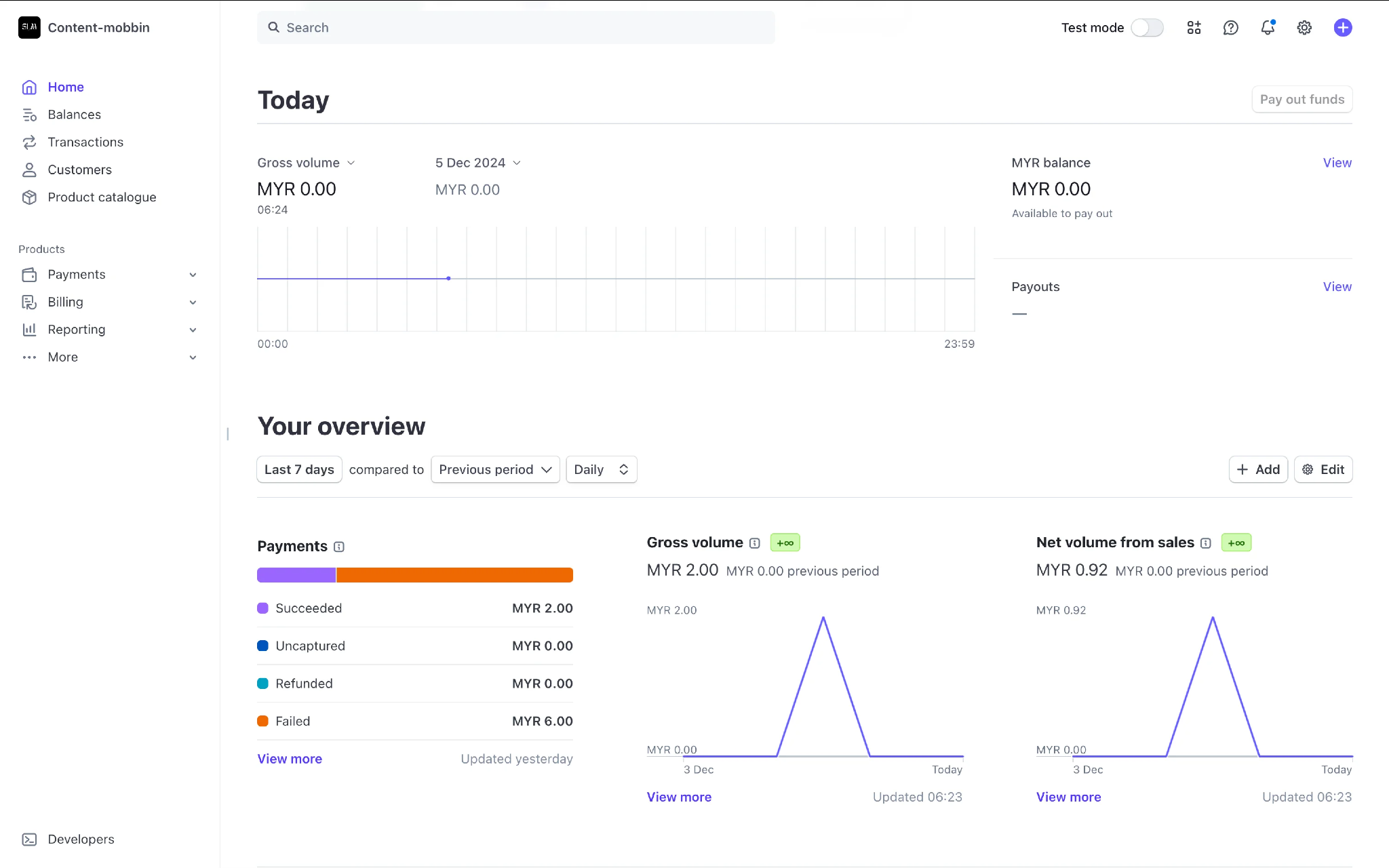
Top-level metrics prioritize quick performance scanning: most important business metrics are shown in large numeric values, each complemented by a trend visualization so users can validate direction at a glance.
Flexible metric and date-based analysis through contextual filters: users can switch metrics and time periods from a single dropdown without navigating away or adding more charts.
Payment health is communicated with exceptional clarity: instead of a total payment count, the overview breaks payments into Successful, Failed, Refunded, and Uncaptured states with a visual distribution bar.
Comparative insights are integrated naturally: Last 7 Days vs Previous Period comparison is placed exactly where users evaluate performance, providing immediate business context rather than isolated numbers.
Purpose-driven data visualization: charts use minimal colors and clean line graphs to support decision-making without competing for attention.
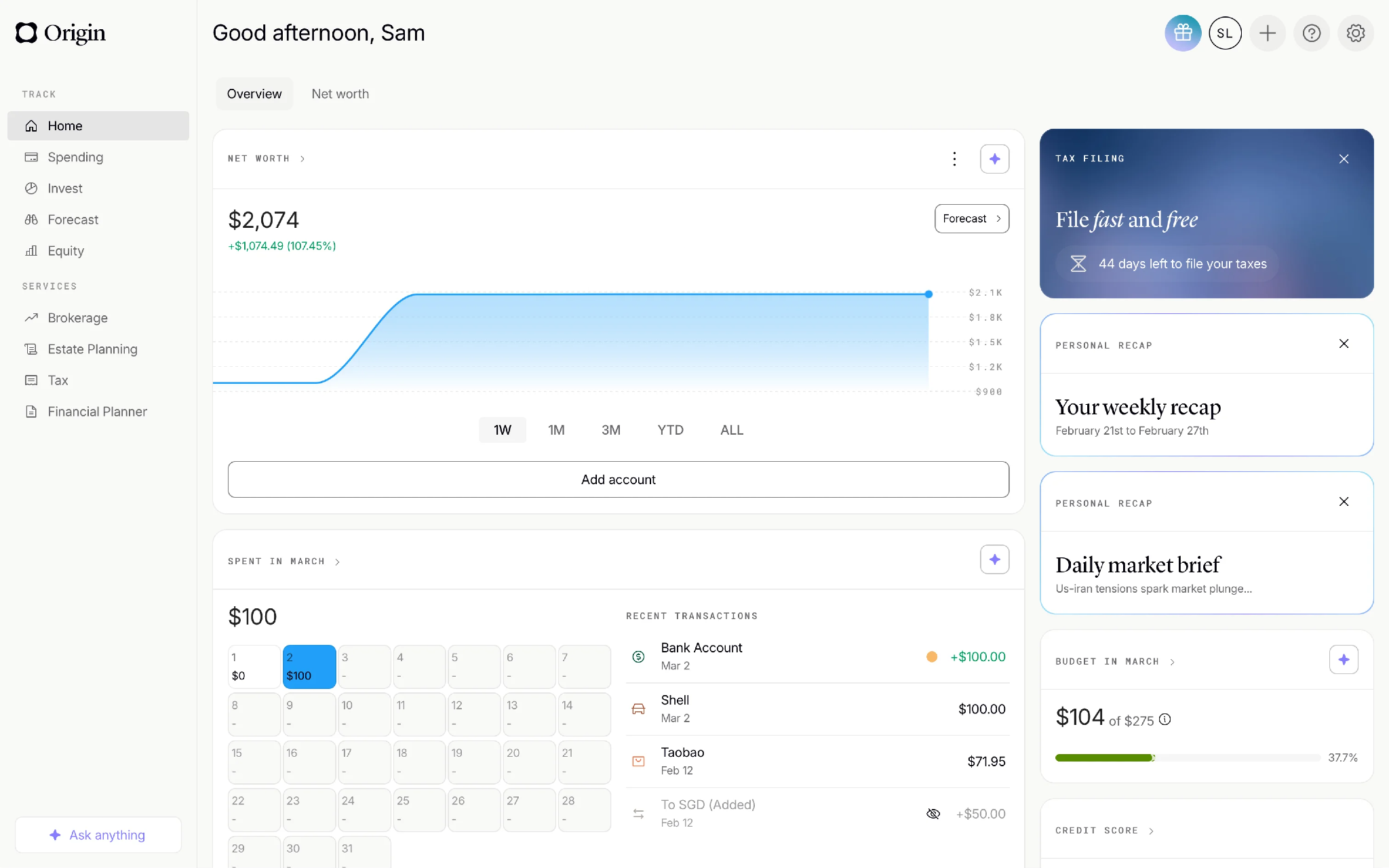
Clean visual hierarchy makes financial data feel approachable: net worth graph displays the latest value directly at the end of the trend line so users understand their current position without estimating from the chart.
Calendar-based spending analysis creates a natural browsing experience: the Spent in March section uses a calendar view instead of a transaction list, letting users select any date to instantly view associated transactions.
Informative side widgets encourage meaningful user engagement: the right panel surfaces tax reminders, weekly recaps, market updates, and financial insights — timely, actionable content rather than static information.
Budget tracking combines numerical clarity with strong visual feedback: the monthly budget widget shows exactly how much has been spent and how much remains alongside a progress bar, making budget status understandable within seconds.
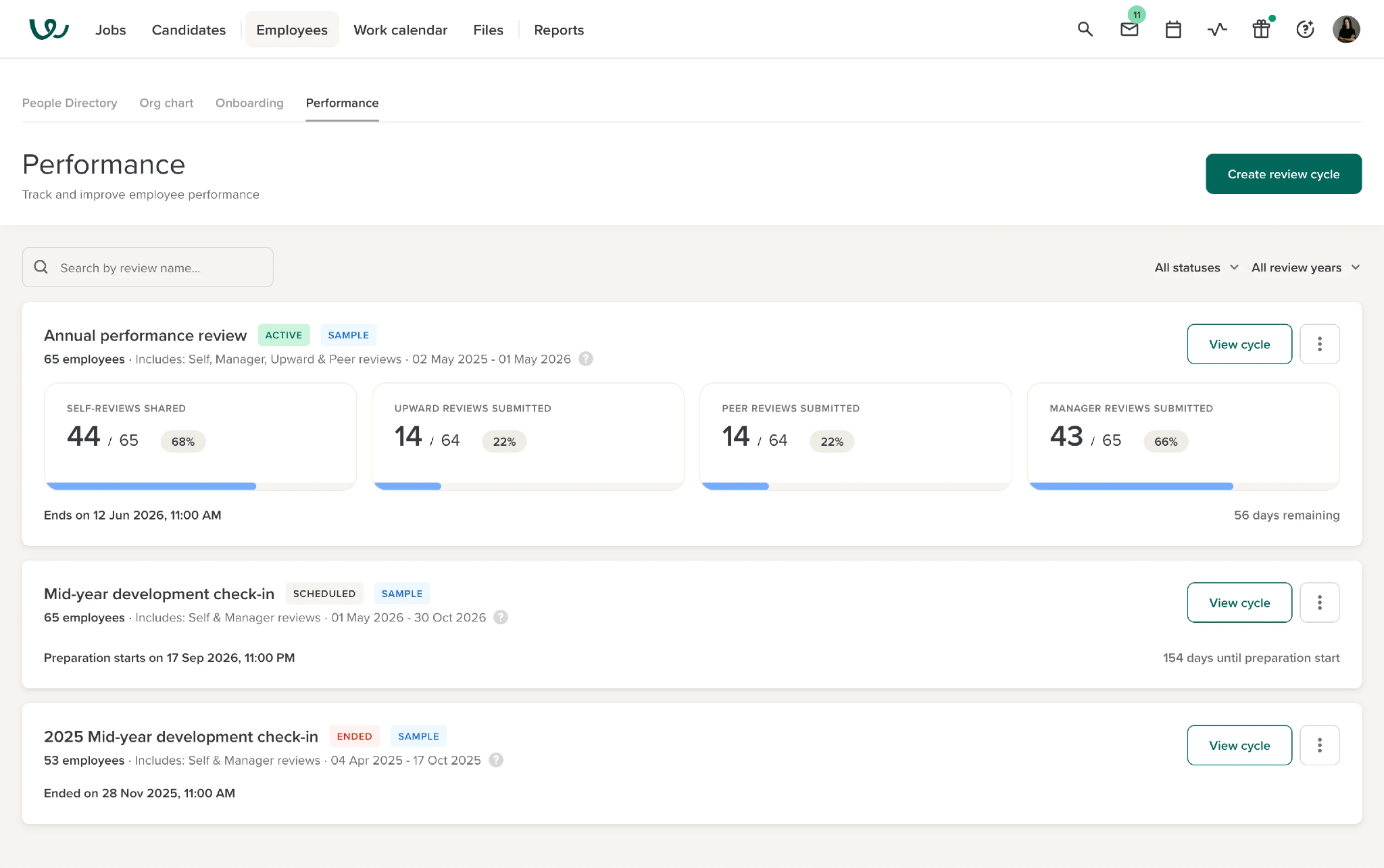
Top navigation maximizes workspace for data-heavy dashboards: moving primary navigation to the top header significantly increases available horizontal space, consolidating navigation, quick actions, and user controls in one area.
Category-wise progress cards simplify performance monitoring: each review stage (Self Reviews, Manager Reviews, Peer Reviews, Upward Reviews) is presented in its own dedicated card with both numerical completion data and a visual progress bar.
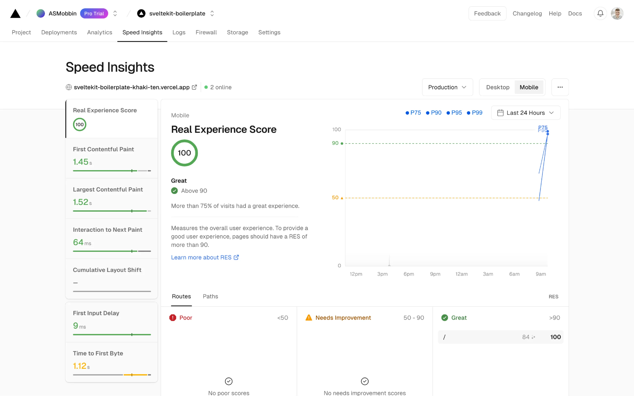
Seamless platform switching keeps performance analysis effortless: users switch between Desktop and Mobile metrics with a single click; metrics are consistently supported with dedicated colors, status indicators, and performance thresholds.
Actionable data visualization: line chart combines performance trends with percentile comparisons (P75, P90, P95, P99), allowing teams to monitor changes and identify regressions without adding visual complexity.
Built-in feedback channel encourages continuous product improvement: a dedicated Feedback action in the header lets users share suggestions or report issues without interrupting their workflow.
Strong visual separation keeps the primary workspace in focus: darker color scheme on left navigation and top header contrasts with the clean white main dashboard, naturally drawing attention toward the analytics workspace.
Floating support widget provides contextual help without disrupting workflow: a movable chat assistant lets users access support without leaving the dashboard and can be repositioned based on working area.
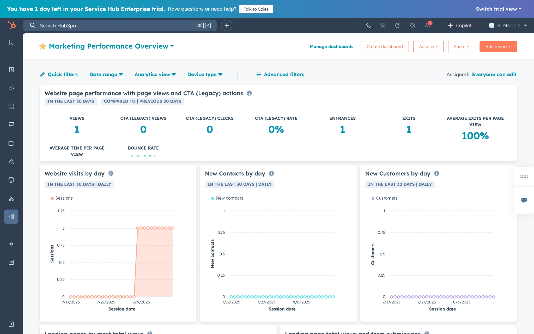
Clear separation between summary and trends: top section answers 'What happened?' while charts below explain 'How performance changed over time,' creating a natural flow for analyzing marketing data.
Action-oriented dashboard design: instead of displaying only financial metrics, Ramp organizes the dashboard around pending tasks (Approvals, Reimbursements, Draft Submissions), making the dashboard workflow-driven rather than just informational.
Minimal visual design creates a calm and distraction-free experience: generous spacing, subtle typography, and well-defined content sections give the interface enough breathing room to process financial information with less cognitive effort.
Global search reduces navigation effort across the entire product: the prominent search bar with placeholder 'Search for anything' communicates that users can search the entire platform from a single entry point.
Illustrations and pastel visuals enhance usability without competing for attention: muted pastel colors and subtle gradients add personality to the interface while ensuring primary actions and financial metrics remain the main focus.
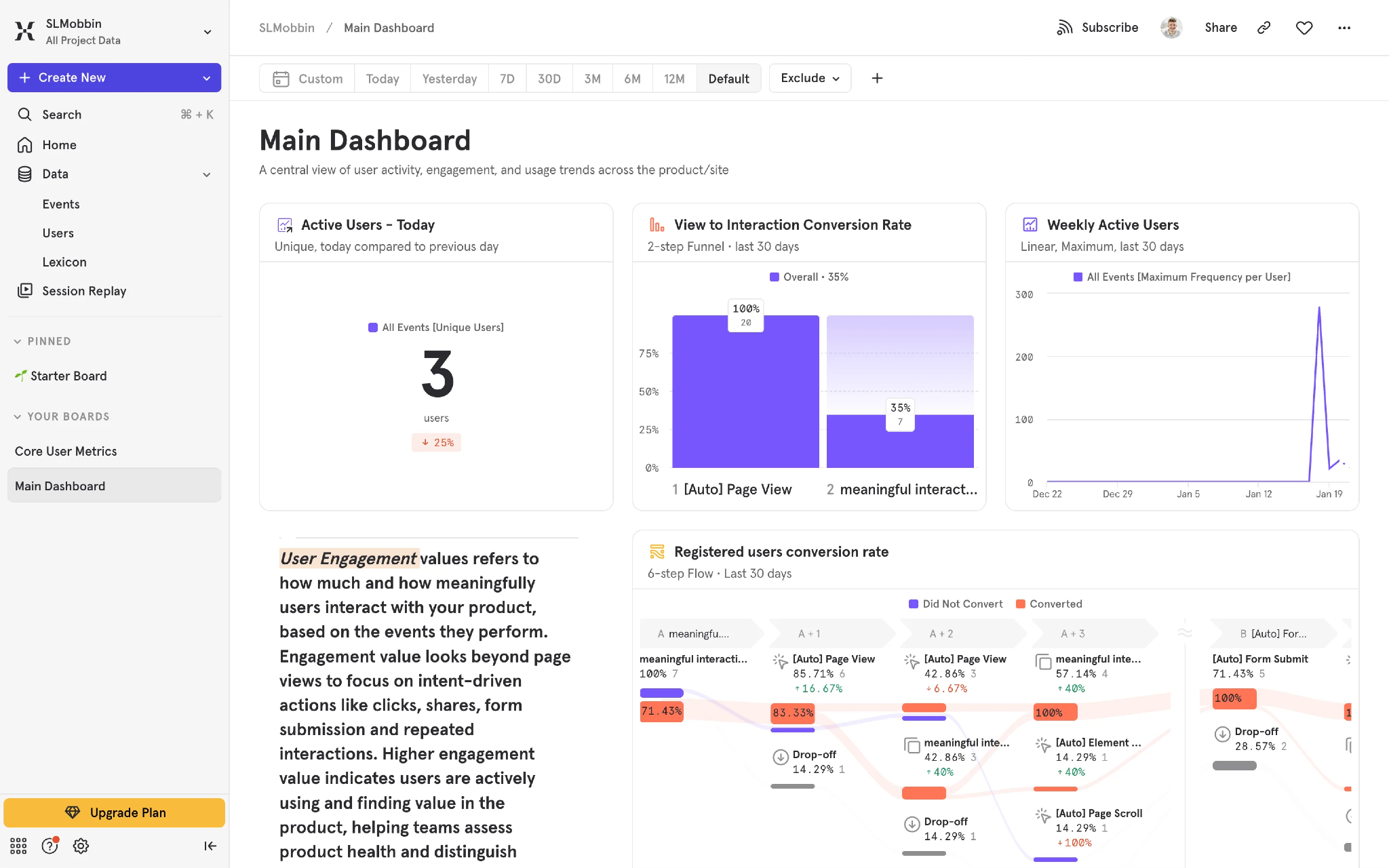
Primary actions are separated from analytical content: Create New and Upgrade Plan are placed within left navigation, keeping them accessible without competing with the dashboard's analytical workspace.
Sticky filter bar enables uninterrupted data exploration: the filter section remains fixed at the top while users scroll, allowing date range and comparison period modifications at any point without navigating back.
Contextual explanations reduce the learning curve for complex metrics: instead of assuming users understand advanced analytics terminology, the dashboard provides in-context explanations for key metrics like User Engagement directly alongside the charts.
The Registered User Conversion Rate is designed as a visual user journey instead of a traditional chart. It shows how users progress through each step of the conversion funnel, where they successfully move forward, and where they drop off, making bottlenecks and optimization opportunities immediately visible without comparing multiple reports.
Consistent visualization patterns reduce cognitive load: across different report types the dashboard follows the same card structure with clear titles, legends, spacing, and actions, allowing users to focus on interpreting data rather than learning new interfaces.
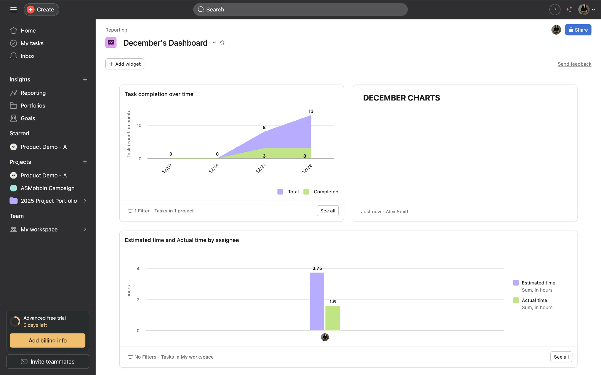
Secondary actions are intentionally moved outside the analytics area: actions like Invite Teammates, Billing, and Free Trial are grouped in the lower sidebar section instead of competing with reporting content.
Empty widgets communicate opportunity instead of dead space: the empty December Charts panel is preserved in the layout, signaling that users can expand the dashboard with additional reports over time - reinforcing the customizable nature of the workspace.
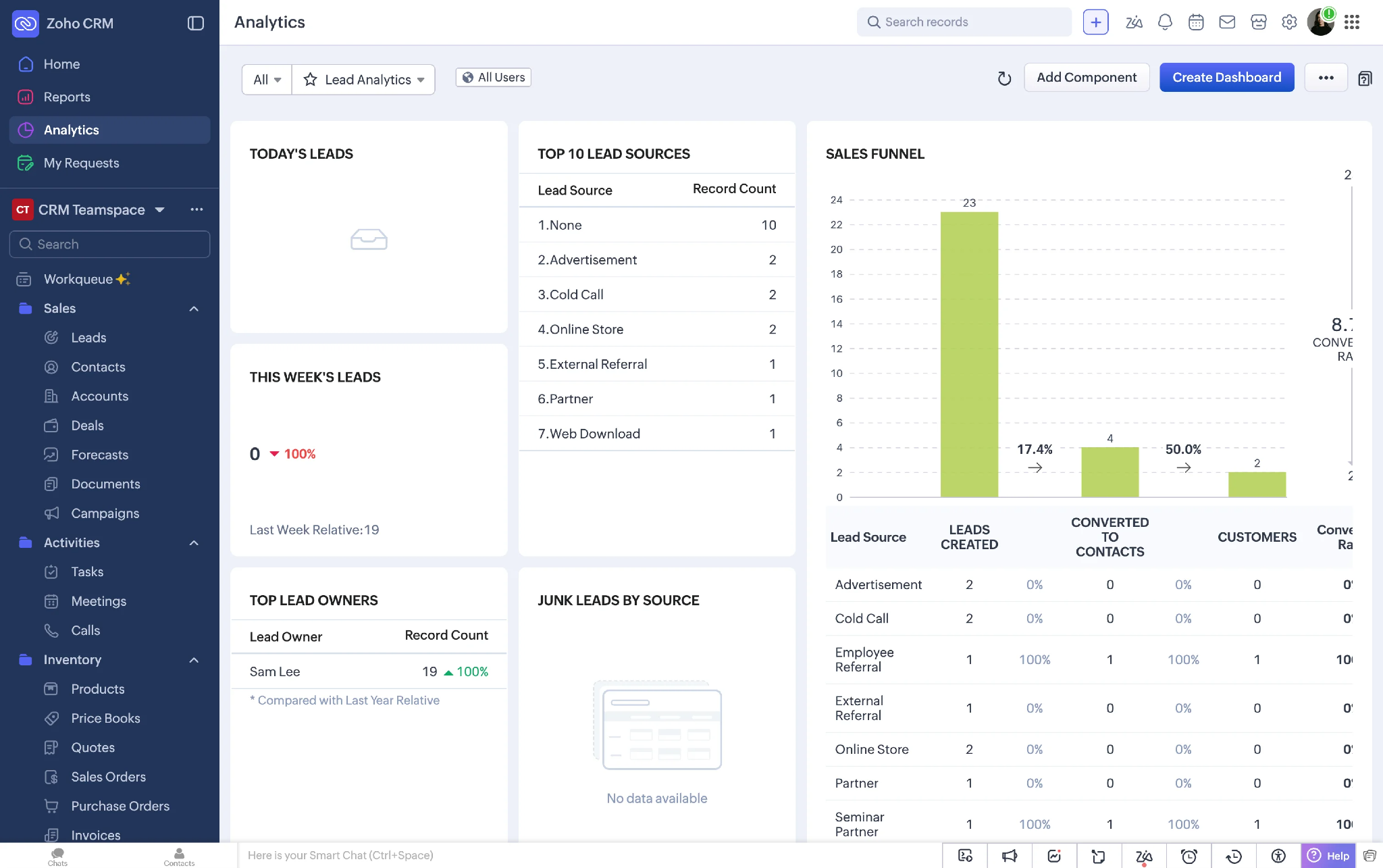
High information density is balanced through a structured card layout: despite presenting a large volume of CRM data, every insight is organized into well-defined cards with consistent spacing, allowing users to scan multiple KPIs simultaneously.
Sales funnel visualization communicates conversion performance at a glance: the funnel chart combines graphical progression with numerical values, displaying conversion percentages between stages so users can identify drop-offs without manually interpreting the chart.
Persistent utility bar keeps essential tools accessible throughout the workflow: frequently used utilities (quick actions, filters, system tools, help) are anchored to the bottom of the interface so users can perform common actions without navigating away.
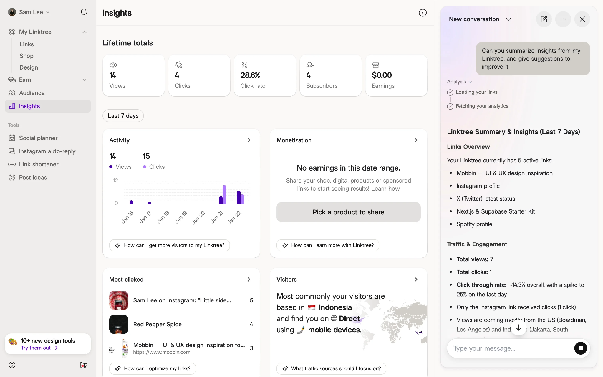
Every KPI card goes beyond showing numbers by providing contextual guidance related to that section. For example, the Activity card suggests ways to increase Linktree visitors, while the Monetization card offers AI-powered recommendations when no products or earnings are available, helping users take the next step instead of leaving them at an empty state.
The Visitors section explains audience insights in simple, human-readable language instead of relying only on charts. A subtle highlighted map reinforces the information visually, making it easy to understand where visitors are coming from and how they are accessing the Linktree page.
A dedicated AI panel on the right allows users to generate real-time summaries of their analytics and ask follow-up questions in natural language. This conversational approach reduces the effort of manually interpreting multiple widgets and makes the dashboard feel more interactive and intelligent.
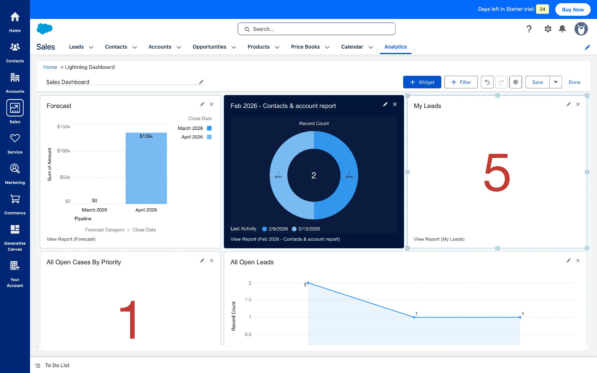
Widgets are fully customizable to match individual workflows: every widget supports editing, resizing, repositioning, and replacement, giving users complete control over how their workspace is organized.
Multi-visualization reporting: the dashboard combines KPI cards, bar charts, donut charts, and line charts to present different aspects of sales performance, helping users understand both high-level business metrics and detailed trends.
Persistent to-do panel supports uninterrupted task management: a fixed To-Do List is anchored at the bottom of the interface, allowing users to capture reminders and follow-ups while working with reports without interrupting the analytical workflow.
Clean analytics-first layout: charts and KPIs take center stage with generous whitespace, minimal color palette, and simple card structure making reports easy to scan without overwhelming users.
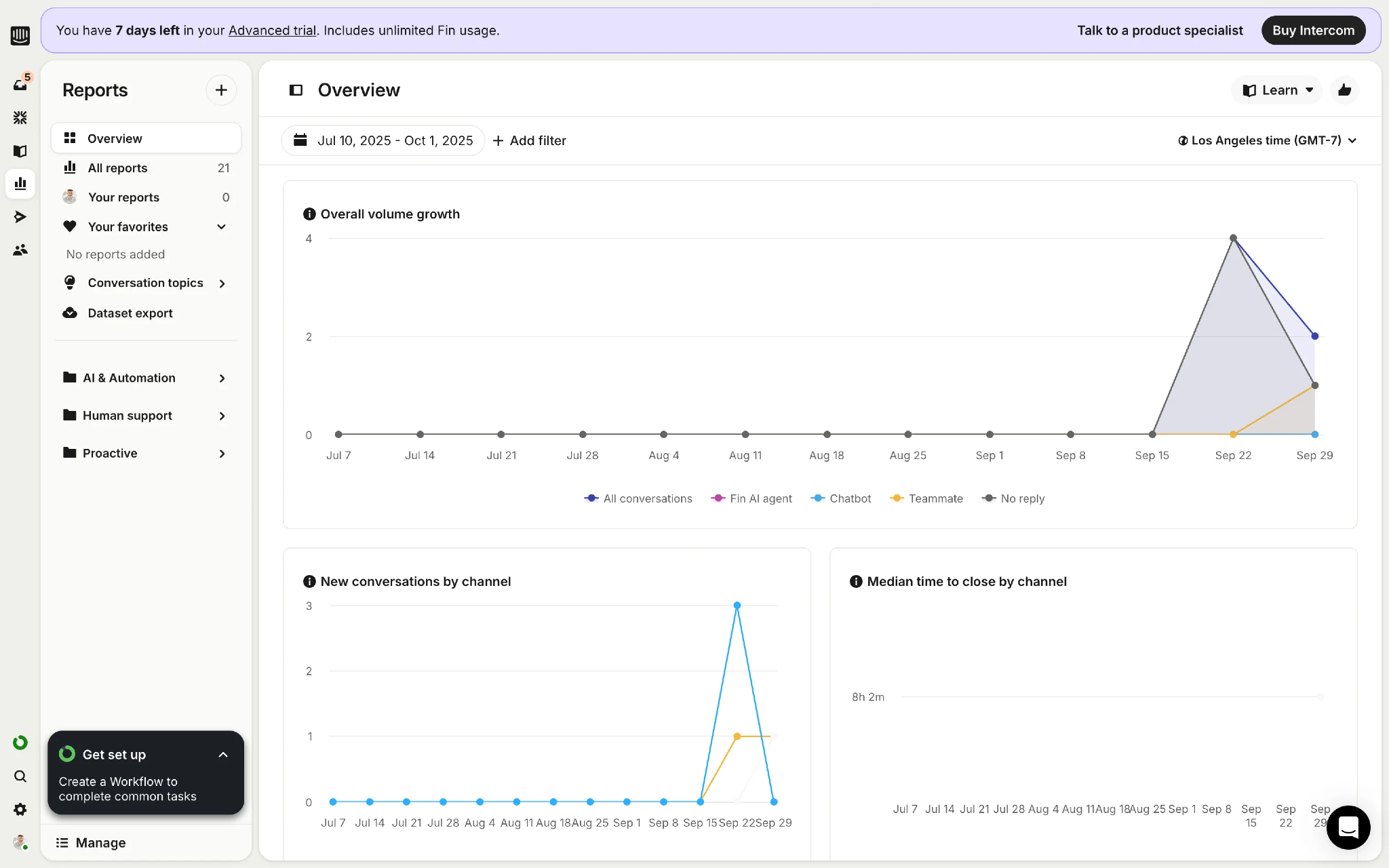
Multi-level navigation is clearly segmented without increasing complexity: the first-level sidebar provides access to core product areas while the secondary panel focuses only on reporting-related modules, keeping the interface organized.
In-product learning makes advanced analytics more accessible: a dedicated Learn section is integrated directly into the analytics workspace, allowing users to access help articles and tutorials without leaving the dashboard.
Progressive insight hierarchy: the dashboard starts with overall conversation trends before drilling down into detailed metrics like New Conversations by Channel and Median Time to Close.
Generous whitespace improves readability and builds trust: the dashboard makes excellent use of whitespace, allowing each card, metric, and action to breathe — especially effective for a financial product where users need to process information with confidence.
Interactive chart controls enable real-time data exploration: the Mercury Balance card lets users switch between chart visualizations while changing the reporting period from the same dropdown, enabling short-term and long-term balance trend analysis without leaving the dashboard.
Thoughtful modular workspace: the dashboard is divided into independent sections for Accounts, Bill Pay, Invoicing, and Balance, allowing users to manage different financial operations from one centralized workspace.
Balanced experience between insights and operations: users can monitor balances, review bills, manage invoices, and perform transactions from a single screen.
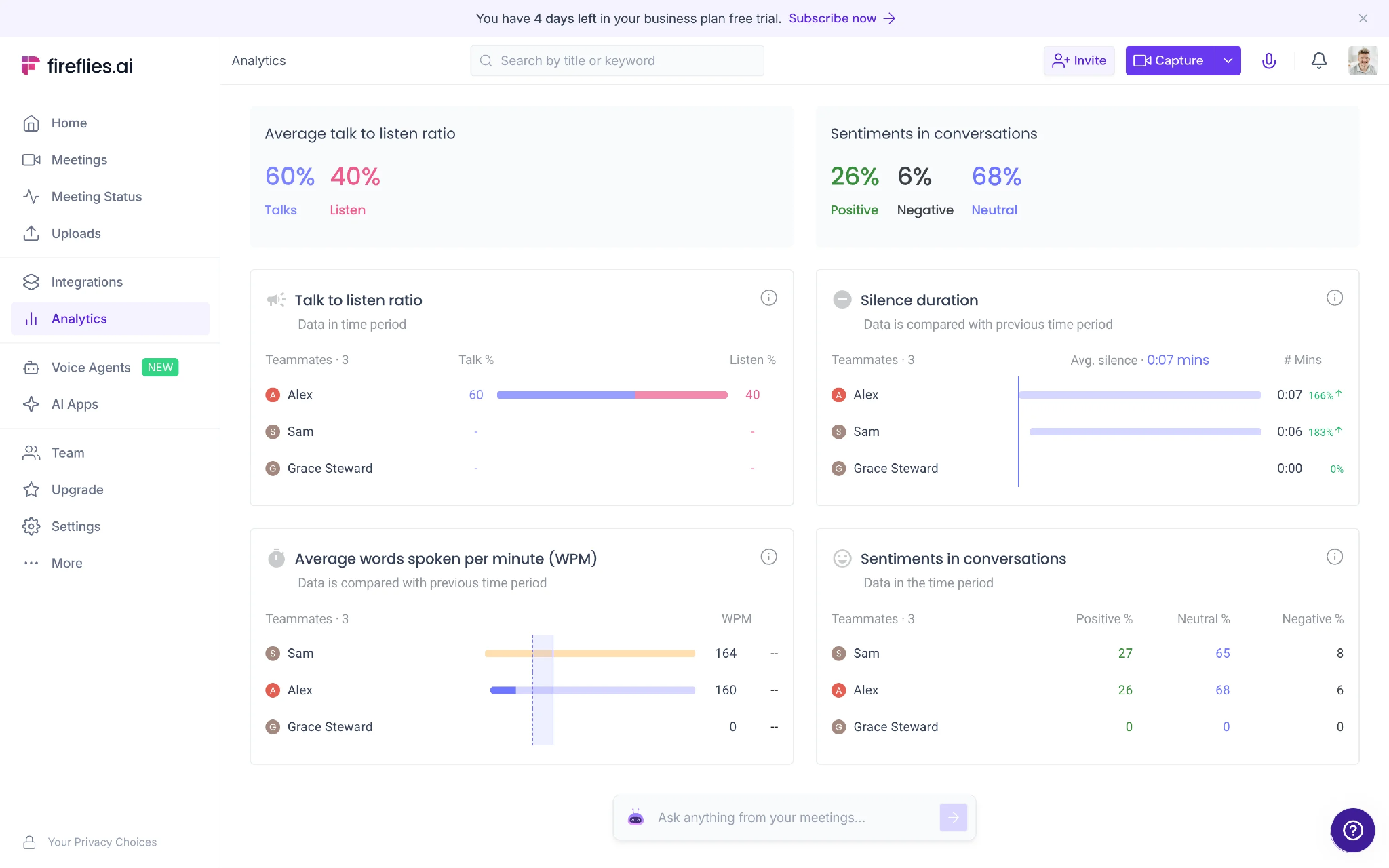
Side-by-side teammate comparison makes performance evaluation effortless: instead of requiring users to open individual profiles, the dashboard compares teammates across Talk-to-Listen Ratio, Silence Duration, Words Per Minute, and Conversation Sentiment within the same view.
AI assistant is embedded directly into the analytics workflow: a centrally positioned AI input box lets users ask questions about meetings in natural language without leaving the analytics page — AI integrated into reporting, not as a separate chatbot.
Summary cards provide an instant snapshot of meeting quality: top overview cards surface the most important communication metrics (Talk vs Listen ratio, Positive/Neutral/Negative sentiment distribution) before users reach detailed reports.
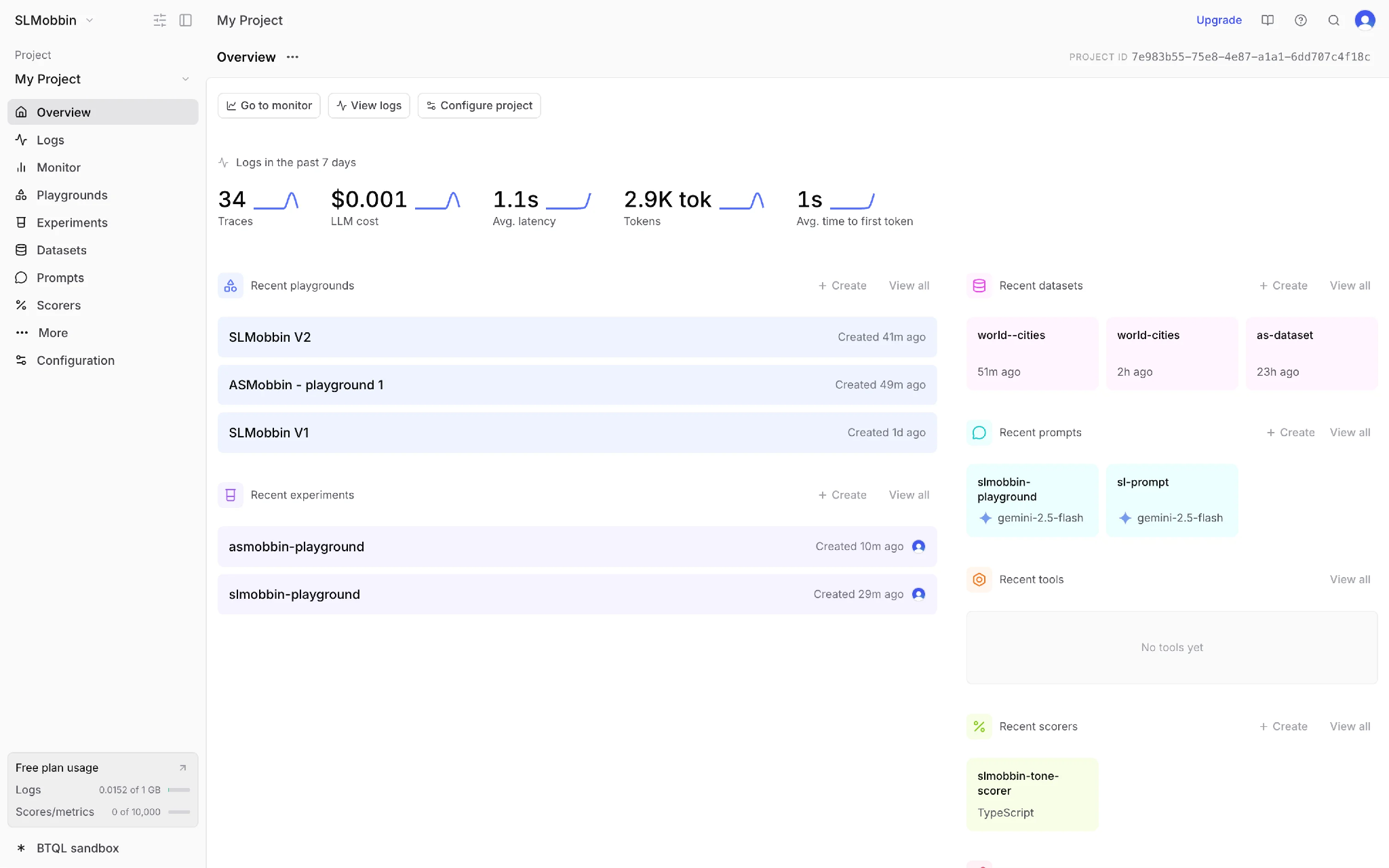
Project context is always visible, improving clarity across workflows: the dashboard clearly communicates which project the user is working on by displaying both Project Name and its unique Project ID in the header — valuable when managing multiple AI projects.
Color-coded sections improve discoverability without increasing visual noise: instead of heavy cards or borders, soft pastel backgrounds and colorful icons differentiate datasets, prompts, experiments, scorers, and other project assets.
Subscription usage is surfaced where it matters most: the left sidebar includes a compact usage summary showing the current plan along with consumption metrics (Logs, Scores/Metrics) and a direct path to the upgrade page when users need additional capacity.
KPI metrics feel lightweight through a borderless presentation: key metrics (Traces, LLM Cost, Latency, Tokens, Time to First Token) are presented in a single horizontal row without enclosing each metric inside separate cards, avoiding the 'boxy' appearance common in many dashboards.
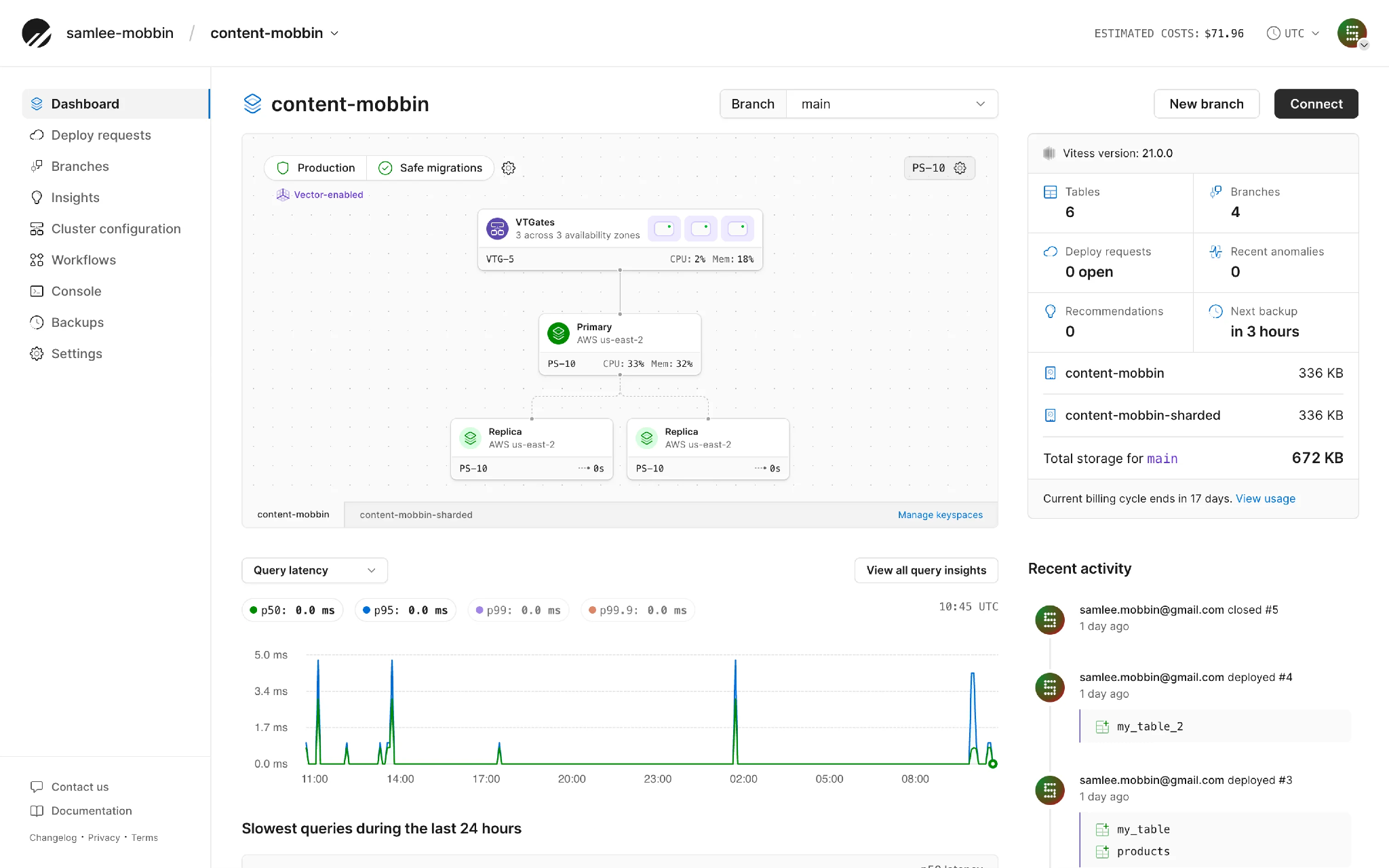
Instead of relying only on charts and KPI cards, the dashboard visualizes the complete database infrastructure, including components like Primary, Replicas, and VTGates. This infrastructure-first approach gives developers an instant understanding of their database architecture and overall system health.
Key operational metrics such as CPU Usage, Memory Usage, Query Latency, and Recent Activity are surfaced directly on the dashboard, enabling users to identify performance issues in real time without navigating through multiple monitoring pages.
A consolidated project summary brings together essential information like Tables, Branches, Deploy Requests, Recommendations, Storage Usage, and Backup Status in one place. This provides users with a quick, high-level overview of the project's current state without switching between different sections.
The Recent Activity panel presents deployments, schema changes, and project updates in chronological order, making it easy to track what has changed over time. This timeline improves collaboration by giving the entire team clear visibility into recent actions and operational history.
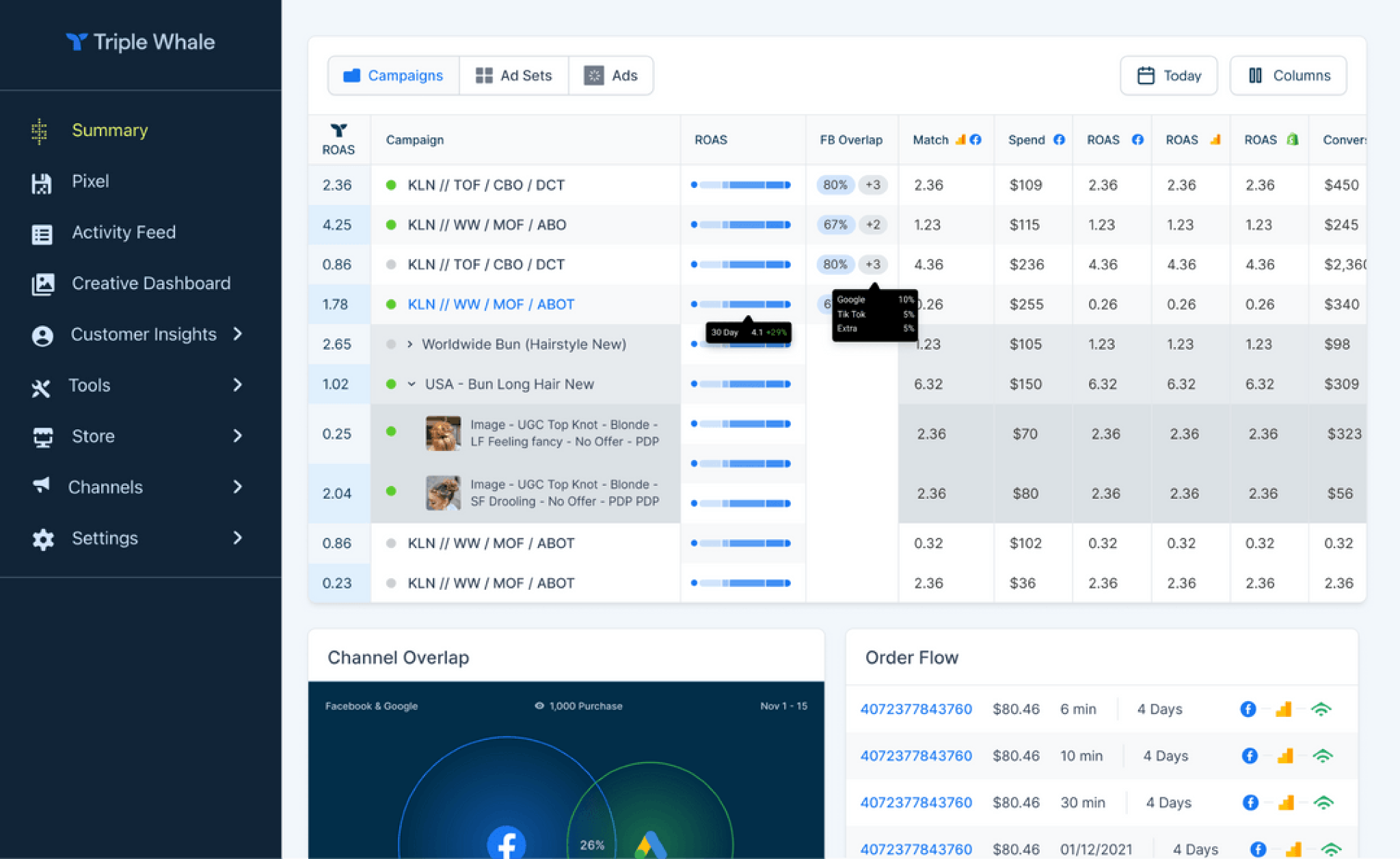
Multi-level campaign analysis: users can seamlessly switch between Campaigns, Ad Sets, and Ads, helping marketers move from high-level summaries to granular campaign insights without changing screens.
Data-dense table with excellent scanability: despite displaying a large amount of performance data, the table remains easy to scan through consistent spacing, visual indicators, and well-structured columns showing ROAS, Spend, and Conversions.
Cross-channel performance visibility: brings performance data from multiple advertising platforms into a single view, allowing channel-specific ROAS and attribution comparisons without switching between ad platforms.
Rich data through progressive disclosure: additional campaign insights are revealed through hover interactions and expandable rows, keeping the dashboard clean while still providing access to detailed performance data on demand.
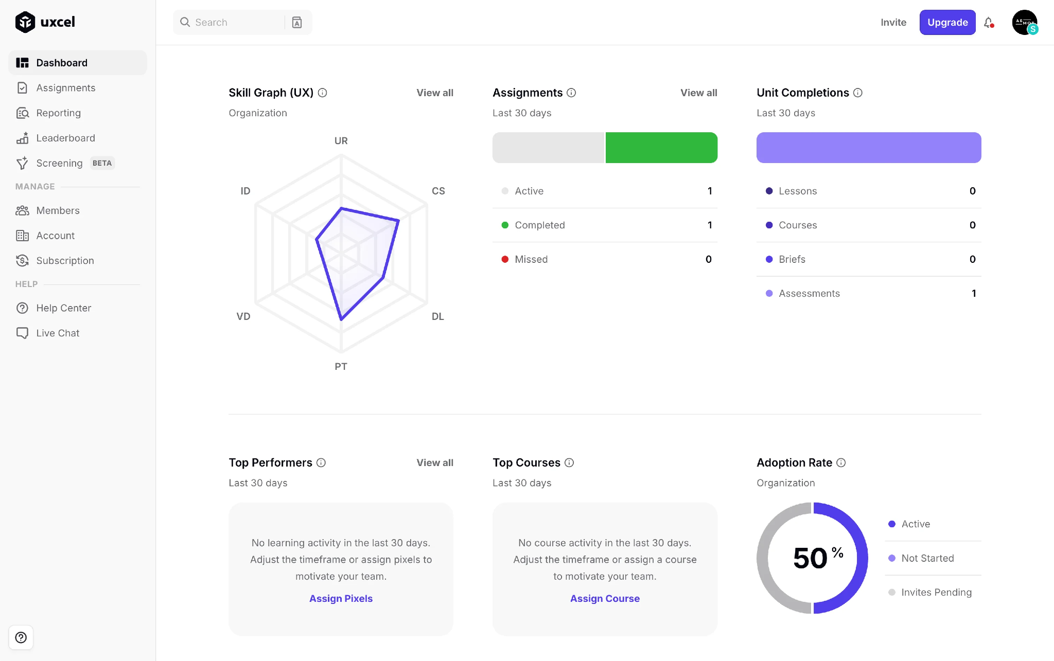
Skill progression is visualized through an intuitive competency graph: a radar chart represents skill distribution across multiple competency areas, making strengths and improvement areas immediately visible.
Empty states guide users toward the next meaningful action: rather than leaving sections like Top Performers and Top Courses blank, the dashboard explains why no data is available and pairs that with a clear CTA (Assign Pixels, Assign Course), transforming empty states into productive ones.
Adoption rate combines percentage and category distribution effectively: the Adoption Rate widget presents the overall percentage using a circular progress chart while simultaneously displaying underlying categories (Active, Not Started, Invites Pending) through matching color legends.
Minimal visual design keeps learning insights easy to consume: whitespace-rich layout with restrained colors and simple visual patterns ensures educational metrics remain easy to scan.
Support resources are accessible without competing with primary workflows: secondary support options (Help Center, Live Chat) are placed within the side navigation rather than the main workspace or top header.
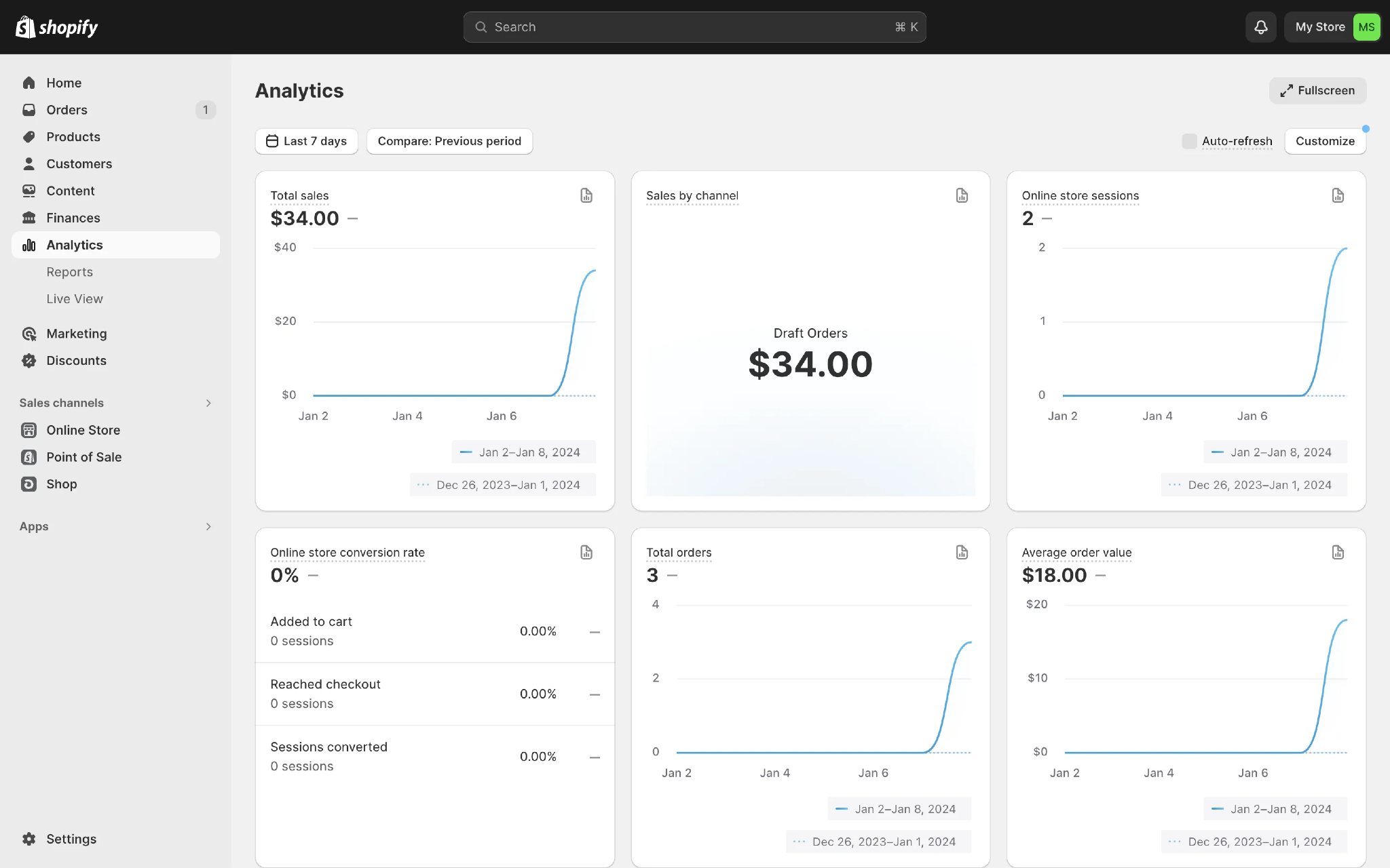
Full-screen mode enhances focus for detailed analysis: unlike most web dashboards, Shopify provides a dedicated Full Screen mode for analyzing reports without interface distractions — particularly useful during presentations or when comparing multiple KPIs.
Neutral card backgrounds create clear visual separation: soft neutral backgrounds behind each analytics card make individual widgets easy to distinguish without relying on heavy borders or shadows, keeping the interface minimal.
Real-time dashboard customization puts users in control: options like Customize and Auto-refresh allow users to tailor the analytics experience and enable or disable live updates based on their workflow.
Contextual tooltips improve discoverability without adding visual clutter: a subtle dotted underline beneath metric titles indicates additional context is available on hover, helping users understand unfamiliar metrics without interrupting their workflow.
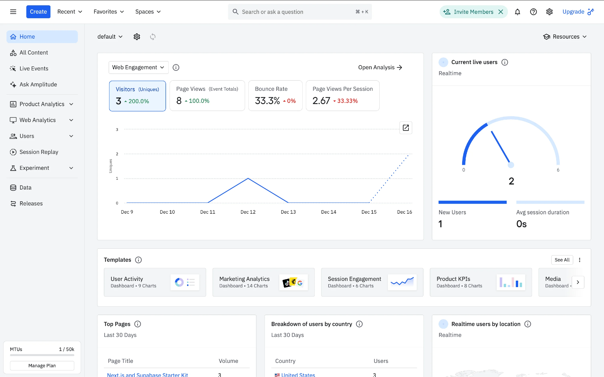
Pre-built templates make dashboard creation effortless: instead of asking users to build from scratch, Amplitude provides a dedicated Templates section with ready-made analytics dashboards (User Activity, Marketing Analytics, Session Engagement, Product KPIs).
Real-time user activity is presented through an intuitive visual indicator: the Current Live Users widget uses a gauge-style visualization to communicate live traffic more engagingly, alongside New Users and Average Session Duration for a quick snapshot.
Analytics context can be switched without changing dashboards: the primary analytics panel allows users to change the focus of displayed insights through a contextual dropdown (e.g. switching from Web Engagement to other analysis categories) without navigating between multiple reporting screens.
5 UX Decisions That Separate Dashboards Users Love From Ones They Ignore
These five decisions appeared consistently across the dashboards that performed well. None of them are about chart selection. All of them are about how information is structured, prioritized, and communicated to the person using the product daily.
1. Decide the Primary Metric Before Designing Anything
Every high-performing dashboard in this audit had one metric that owned the screen. Stripe surfaces Gross Volume. Vercel leads with Real Experience Score. Shopify opens with Total Sales. Origin greets users with Net Worth. These are not accidental. They are deliberate decisions about what this user needs to understand first. If a user opens your dashboard and has 10 seconds, what is the one number they need to see? Design starts there, not with a Figma file.
2. Make the Dashboard Action-Oriented, Not Just Informational
Data that does not lead to a decision is noise. Ramp organizes the entire home screen around pending approvals and outstanding tasks. Mercury places banking actions before financial metrics. Manus surfaces AI suggestions directly alongside the data. Fireflies puts an AI input box at the bottom of the analytics screen so users can ask questions about their meetings without switching contexts. If a user can read your dashboard and still not know what they should do next, the hierarchy needs work.
3. Use Progressive Disclosure, Not Full Exposure
The instinct to show everything upfront is the single most common dashboard mistake. Amplitude opens with high-level engagement metrics before surfacing trend visualizations, realtime monitoring, and detailed breakdowns. Vercel shows the overall Real Experience Score before breaking it into individual Core Web Vitals. Intercom starts with overall conversation trends before drilling to channel-specific metrics and Median Time to Close. Users should understand the dashboard at a glance, then drill into specifics on demand. Not the other way around.
4. Give Every Number Context, Not Just the Number
A metric without a reference point is meaningless. 342 active users is not information. 342 active users, up 18% from last week, is information. Stripe integrates Last 7 Days vs Previous Period comparisons directly alongside every metric. Shopify builds Previous Period comparison into every card. Mixpanel provides in-context explanations for complex metrics like User Engagement directly within the dashboard. Uxcel shows Adoption Rate as a percentage alongside the category breakdown of Active, Not Started, and Invites Pending in a single widget. If a number cannot answer whether it is good or bad on its own, it is missing context.
5. Design for the User's Workflow, Not the Data Schema
The most common reason dashboards feel overwhelming is that they were built around how the database is structured, not how the user does their job. Workable organizes performance reviews by cycle stage because that is how HR managers think about their work. Fireflies replaces generic business metrics with conversation-specific KPIs (Talk-to-Listen Ratio, Silence Duration, Words Per Minute) because that is the actual workflow of a sales enablement team. Zoho CRM anchors the dashboard around the Sales Funnel because that is the lens through which a sales leader evaluates the business. The data model is irrelevant to the user. Their job is not.
The Same Pattern Across Very Different Product Categories
These five decisions held across every category in the audit, not just the obvious ones.
Braintrust and PlanetScale serve completely different technical buyers — AI development tooling and database infrastructure respectively. But both make the same structural choice: project context (Project Name, Project ID) is always visible in the header. Users managing multiple projects never lose track of which environment they are working in. The underlying design logic is identical even though the products have nothing in common.
Triple Whale and HubSpot both serve marketing teams, but at completely different levels of data density. Triple Whale goes deep into multi-level campaign analysis with data-dense tables and progressive disclosure through hover interactions. HubSpot leads with clean KPI cards and separates summary from trend charts into distinct sections. Different complexity, same structural principle: surface what matters first, give everything else a layer below.
Uxcel does something almost no analytics dashboard does: it turns empty states into guidance. Instead of blank sections when data is missing, it explains why and pairs that explanation with a direct action. That is a workflow design decision, not a data decision.
What To Do With This
Before your next dashboard sprint, run this audit on your current product. Open your dashboard as a first-time user and answer four questions: Is there one metric that immediately tells me the health of what I am monitoring? Does the screen tell me what I should do, or just what happened? Can I understand the high-level picture without clicking anything? Does every number tell me whether it is good or bad?
If you cannot answer yes to all four, the problem is not the chart library. It is the hierarchy you have not defined yet.
If you are building or redesigning a SaaS dashboard and want a team that starts with information architecture before touching Figma, that is exactly how we approach SaaS product design at Fluidesigns. See how we work. For teams that need the same thinking applied to their B2B website.

%20(2).png)