Published

June 29, 2026

SaaS Website UX Design: What Actually Converts

Tags
SaaS
UX Design
UX Process
Website
Research

A funded SaaS startup came to us after their third website redesign in two years. Bounce rate was still high. Demo requests had barely moved. Their instinct? The design needed to be more modern. After spending 30 minutes on their site, the problem was obvious: visitors could not tell what the product actually did until the fourth scroll.

That is a SaaS website UX design problem, and it is one of the most fixable. Rather than dwell on what goes wrong, this article looks at the other direction. We reviewed 20 high-performing SaaS websites that get UX right, and the rest of this piece breaks down what they do and what your team can learn from them.

What 20 Good SaaS Websites Get Right

Most conversations about SaaS website performance focus on UI. Fresher visuals, trendier color palettes, smoother animations. Design agencies sell redesigns. Founders approve budgets. And conversion rates stay flat.

UI design matters, and it matters more than ever. It is one of the biggest pains with the current wave of AI-generated websites. They have no personality. They do not look professional. Everything feels templatized, like five layouts reskinned a thousand times. And the messaging is rarely on point either.

Strong visuals alone are not enough. The other half of the problem is messaging hierarchy. Within the first five seconds, a visitor needs to understand three things: what the product does, who it is for, and why it matters to them. Most SaaS websites fail at least one of these. The 20 sites we reviewed stand out because they get both halves right, clear visual craft paired with clear communication.

It Is Not Just UI, and It Is Not Just Messaging

Most SaaS teams design their website the way they would design a product brochure: list the features, add some testimonials, drop in a CTA, call it done. The sections exist. The information is there. But the experience does not move anyone toward a decision.

A high-converting SaaS website functions more like a guided conversation. It anticipates what a visitor is thinking at each point in the scroll and answers that specific question before they ask it. What does this do? Why should I believe you? How does it actually work in practice? Can someone like me trust this? What do I do next?

The difference between a brochure and a conversion machine is narrative flow. One is a collection of sections. The other is a structured story where each section earns the next. When you analyze the websites that consistently convert, this is the thing that separates them from the ones that look good but underperform.

What 20 SaaS Websites Revealed About What Actually Works

We analyzed 20 SaaS websites across HR, fintech, analytics, customer support, AI tools, and scheduling. For each, we documented specific UX decisions: what the hero communicates, how social proof is positioned, whether the scroll tells a coherent story, and how the CTA is handled.

Below is the full teardown. The patterns at the bottom of this section are what we extracted as repeatable principles.

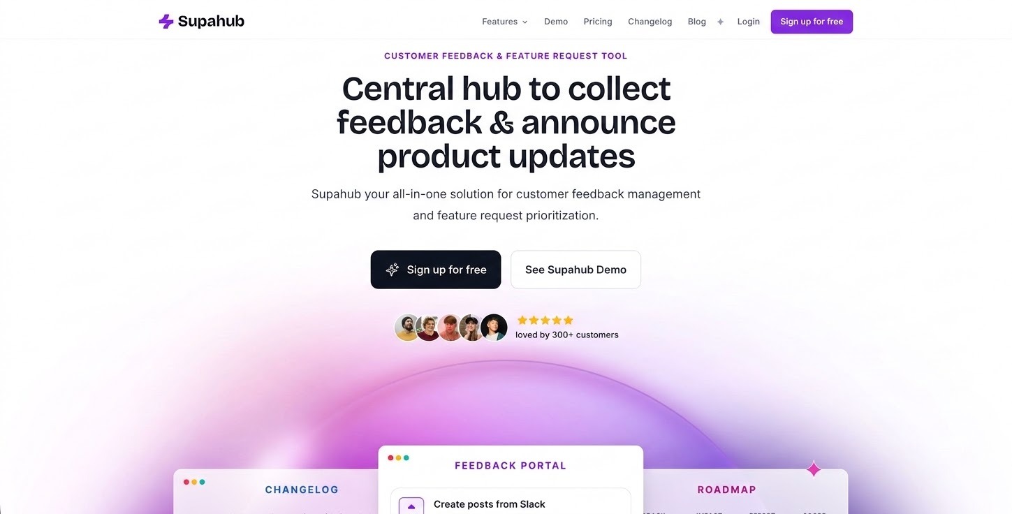
1. Supahub

SaaS Website UX Design - Supahub
Source: Supahub
  • Clear and direct hero: visitors understand within seconds that this is a feedback collection and product update tool.
  • Minimal, distraction-free layout with enough whitespace to guide the eye without crowding.
  • Strong visual hierarchy: headline, short description, CTA, then features, in that order.
  • Social proof (testimonials and user references) placed to build B2B trust early.

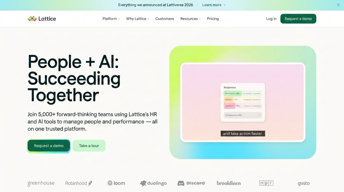
2. Lattice

SaaS Website UX Design - Lattice
Source: Lattice
  • Enterprise-level design maturity: typography scale and grid system signal large-org credibility.
  • Positions as a complete people management ecosystem (performance, engagement, HR, AI), not a single-feature tool.
  • Strategic color palette: neutral base with accent colors that highlight key areas without distraction.
  • Strong narrative flow: big idea → platform overview → product modules → AI capabilities → customer proof → CTA.
  • Tone balances professional language with human-centered themes, making the brand approachable at scale.

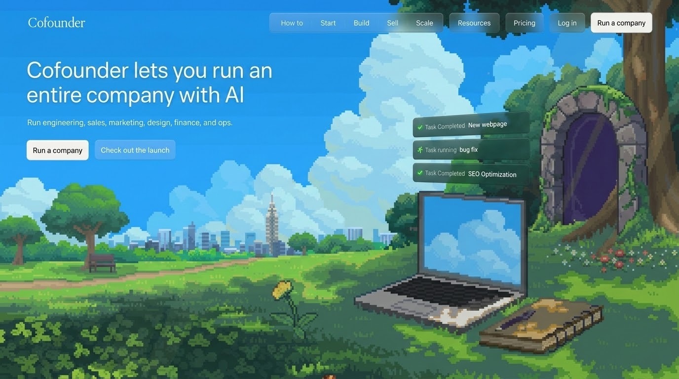
3. Cofounder

SaaS Website UX Design - Cofounder
Source: Cofounder
  • Natural language-first positioning: “Cofounder lets you run an entire company with AI”
    sets the product apart immediately.
  • Interactive, task-focused feature showcase: shows real use cases (startup analysis, resume building) instead of generic cards.
  • Integrations section acts as a value signal, showing connected tools upfront rather than hiding them.
  • Concrete task examples (daily calendar briefing, blog post monitoring) replace abstract feature claims.

4. Moveworks

SaaS Website UX Design - Moveworks
Source: Moveworks
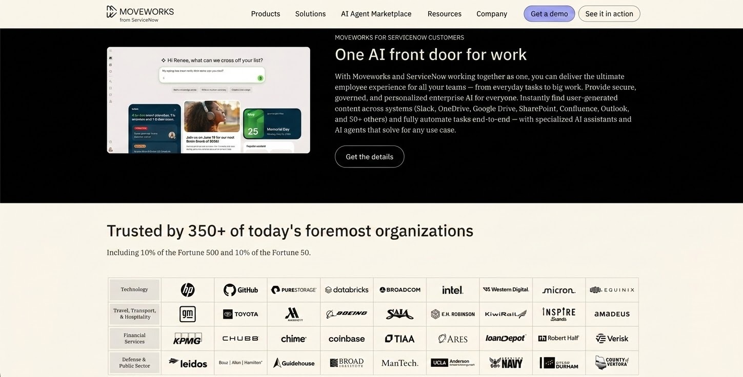
  • Enterprise-grade mega-menu structure supports complex offerings and signals depth to large buyers.
  • Technical and strategic messaging: explains how the platform works, not just what it does.
  • Storytelling through structured sections: capabilities → use cases → trust and security → customer proof.
  • Trust signals are front-loaded: 350+ enterprises, Fortune 500 presence mentioned early.
  • Comprehensive resource section (glossary, webinars, AI marketplace) signals education-first positioning.

5. Wispr Flow

SaaS Website UX Design - Wispr Flow
Source: Wispr Flow
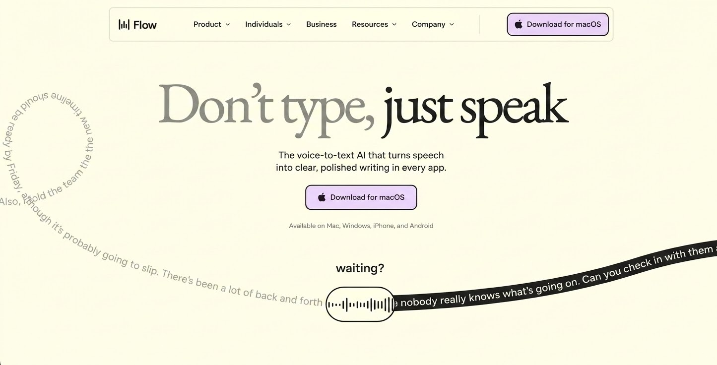
  • Voice-forward value proposition lands immediately: 'Don't type, just speak' leaves no ambiguity.
  • Real-world use cases shown in actual apps (email, docs, coding), not generic product mockups.
  • Visual hierarchy reinforced with contrast (typing vs. Flow at 4x speed), not just copy.
  • Device availability and platform support shown upfront, setting expectations before scroll.
  • Audience-segmented navigation (Students, Developers, Sales) helps the right visitor self-qualify fast.

6. SafetyKit

SaaS Website UX Design  SafetyKit
Source: SafetyKit
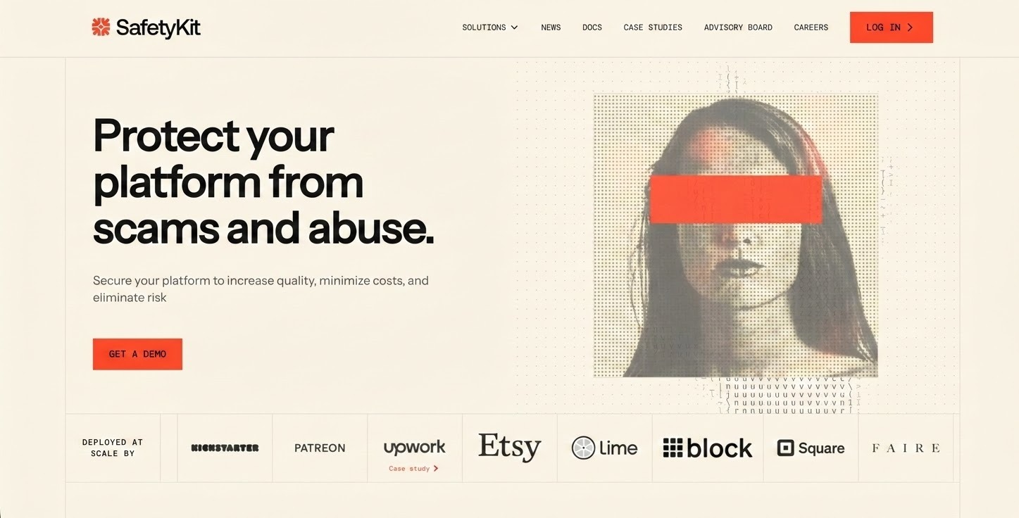
  • Product purpose is clear from the first line: Protect your platform from scams and abuse.
  • Icons and color tones match the serious product category, reinforcing trust through visual alignment.
  • Features grouped with short titles and descriptions: scannable without reading full paragraphs.
  • Consistent layout and spacing across sections communicates reliability, relevant for safety-focused buyers.
  • CTAs (Log in, Get a demo) placed at logical moments without disrupting content flow.

7. Antimetal

SaaS Website UX Design - Antimetal
Source: Antimetal
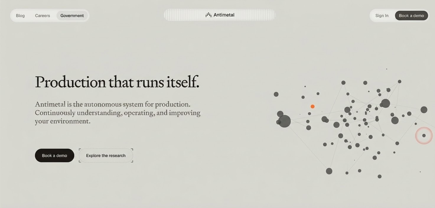
  • Immediate audience positioning: headline speaks directly Production that runs itself..
  • 'Book a demo' CTA placed consistently at key entry points, no searching for next step.
  • Capabilities broken into clear categories (Diagnose, Fix, Prevent), easy to understand primary value.
  • Visual hierarchy drives users from problem to solution using short content blocks and section headings.
  • Impact statistics (faster resolution time, hours saved) help technical buyers evaluate quickly.

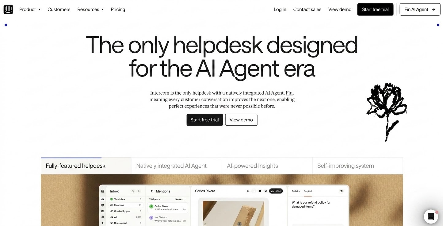
8. Intercom

SaaS Website UX Design - Intercom
Source: Intercom
  • The hero immediately communicates that Intercom is built for the AI Agent era, making the platform's direction clear from the first fold.
  • The category cards below the hero act as a quick overview of the entire platform, helping users jump directly to the area that interests them.
  • Visual hierarchy is well-balanced: important messages and CTAs lead, supporting details follow.
  • UI screenshots show the product in actual context, helping users imagine the experience before signing up.
  • One of the most unique sections on the site, highlighting how the platform continuously learns from conversations and improves over time.
  • Instead of replacing support agents, Intercom shows how AI and humans work together, making the solution feel more practical and realistic.

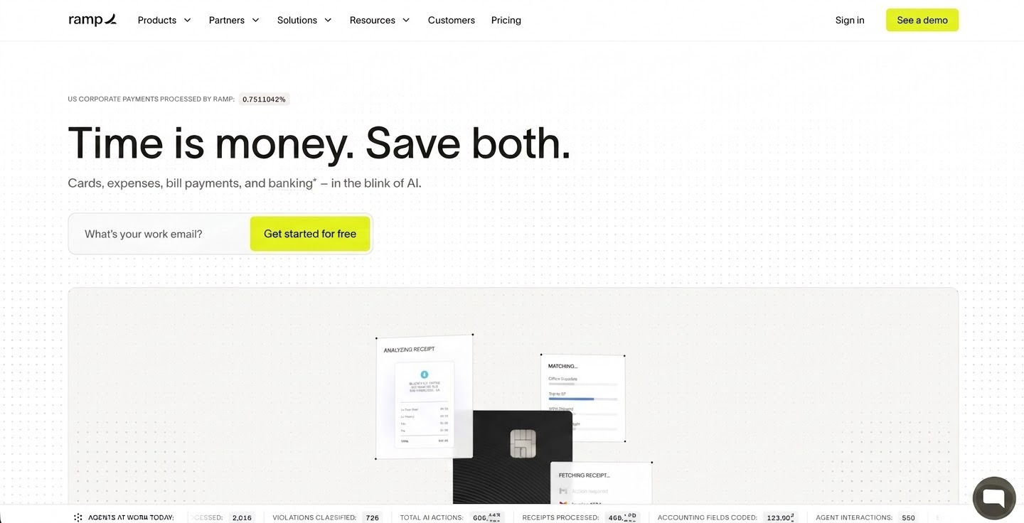
9. Ramp

SaaS Website UX Design - Ramp
Source: Ramp
  • Clear, bold value proposition: a smarter way to manage company spend, understood in seconds.
  • Consistent visual hierarchy throughout: headlines and CTAs stand out, supporting text is subordinate.
  • Real business impact numbers (savings, efficiency gains) used instead of generic phrases.
  • Actual dashboard screenshots and contextual visuals, not abstract shapes or icons.
  • Demo video treats conversion as a trust path: seeing real workflows reduces hesitation.

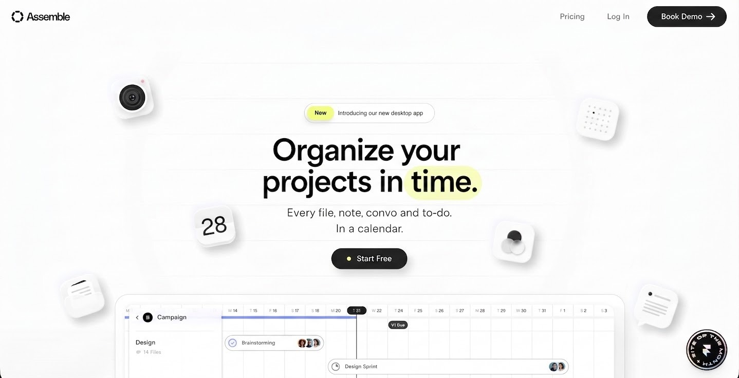
10. OnAssemble

SaaS Website UX Design in USA - OnAssemble
Source: OnAssemble
  • Hero shows real tasks the product can help with, not just a generic slogan.
  • Scroll effect in the second fold forces users to slow down and absorb achievement stats, reducing skipping.
  • Use-case-driven layout: shows how different teams use the product, not a feature dump.
  • Final CTA ('Ready to get organized?') is direct and places after value explanation, not before.

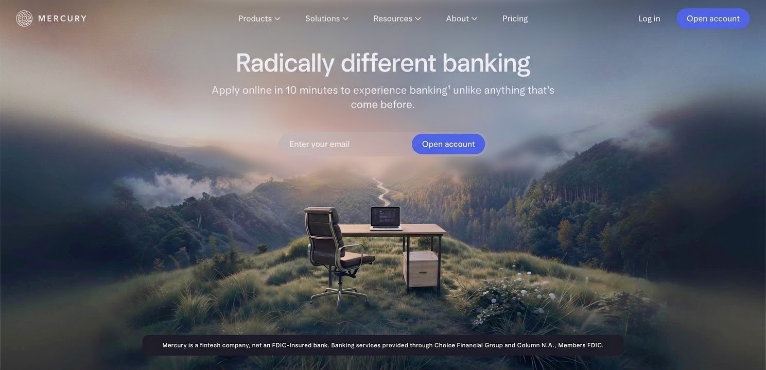
11. Mercury

SaaS Website UX Design USA - Mercury
Source: Mercury
  • Confidence through simplicity: complex banking concepts simplified without financial jargon.
  • Reduced friction in decision-making: enough information to build trust without overloading the user.
  • Strong end-state clarity: when you reach the bottom of the homepage, the next step is obvious.

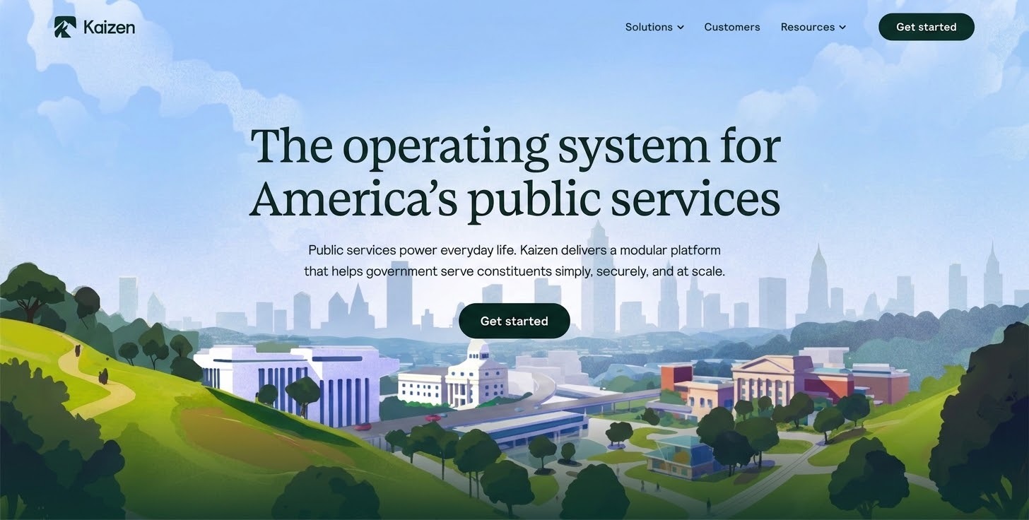
12. Kaizen Labs

SaaS Website UX Design in United States - Kaizen Labs
Source: Kaizen Labs
  • Purpose is immediately clear from the headline: building digital products that solve real business problems.
  • Benefit-focused copy throughout: outcomes (growth, ROI, user experience) instead of service titles.
  • User journey guide: problem understanding → solution approach → why this team → proof → next step.
  • Interaction cues are consistent: highlight colors and button behaviors are predictable across sections.
  • Final CTA invites conversation rather than forcing a hard sell, reducing pressure while maintaining conversion.

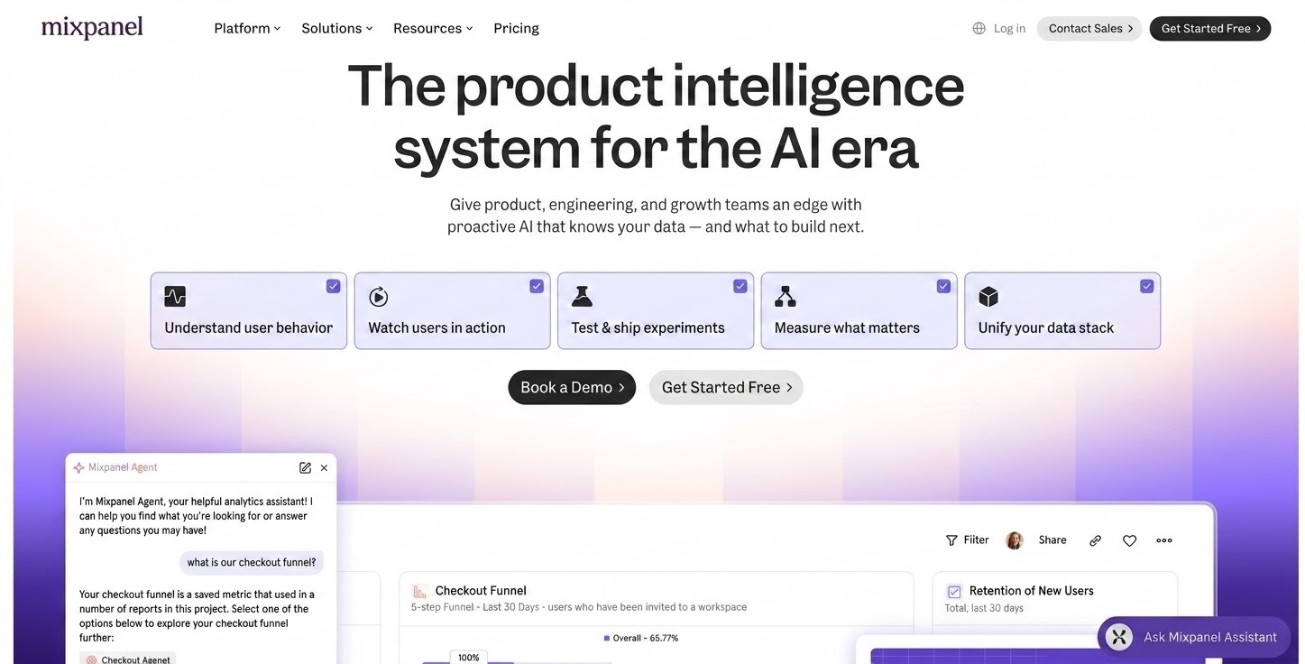
13. Mixpanel

SaaS Website UX Design in United States USA - Mixpanel
Source: Mixpanel
  • Intent-based navigation: cards are structured around user goals ('What do I want to achieve?'), not product features.
  • Well-paced information density: mixes short statements, visuals, and whitespace to reduce cognitive load.
  • Security and compliance details present without distracting from the core CTA.
  • Analytics screens shown in real context, not abstract mockups, because the product is inherently visual.
  • Role-focused messaging (product teams, growth teams, data users) makes it feel personalized.

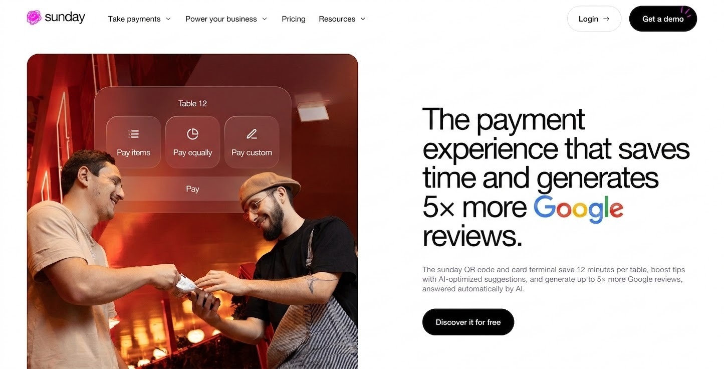
14. Sunday App

Top SaaS Website UX Design - Sunday App
Source: Sunday App
  • Headline immediately tells what Sunday does: simplify meetings and project coordination.
  • Real-life scenarios (planning meetings, coordinating tasks) used as entry points instead of feature lists.
  • Outcome-first messaging: shows what you get once you use it, not just what it does.
  • Visual cues complement copy without distracting from it. Visuals support, not decorate.
  • Consistent tone throughout: color accents, copy, and layout work in harmony with no mood shifts.

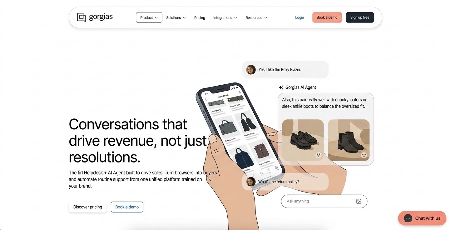
15. Gorgias

Top SaaS Website UX Design - Gorgias
Source: Gorgias
  • Demo video in the hero gives instant product clarity without requiring text explanation.
  • Consistent hierarchy and spacing: users pick up key ideas without reading every line.
  • Outcome-focused copy: many sections explain impact (saved time, improved response rates) over feature lists.
  • Logical flow from problem (disjointed support systems) to solution to trust to action.
  • Problem-solution framing mirrors how users actually evaluate support tools.

16. Pace

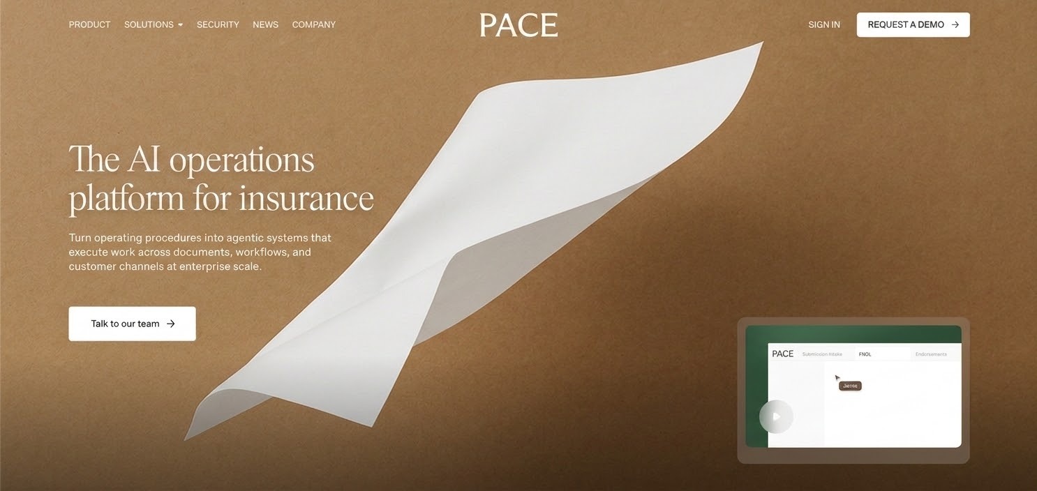
Leading SaaS Website UX Design - Pace
Source: Pace
  • Strong emotional tone: human language that resonates with teams focused on workplace culture.
  • Experience-first messaging: talks about feeling and outcomes before listing technical features.
  • Philosophy before functionality: sells a mindset shift about how work should feel, making the brand memorable.
  • Modern but restrained visual design: no excessive animations or trendy effects.
  • Curated emotional journey guides users from curiosity to alignment to action.

17. Refold AI

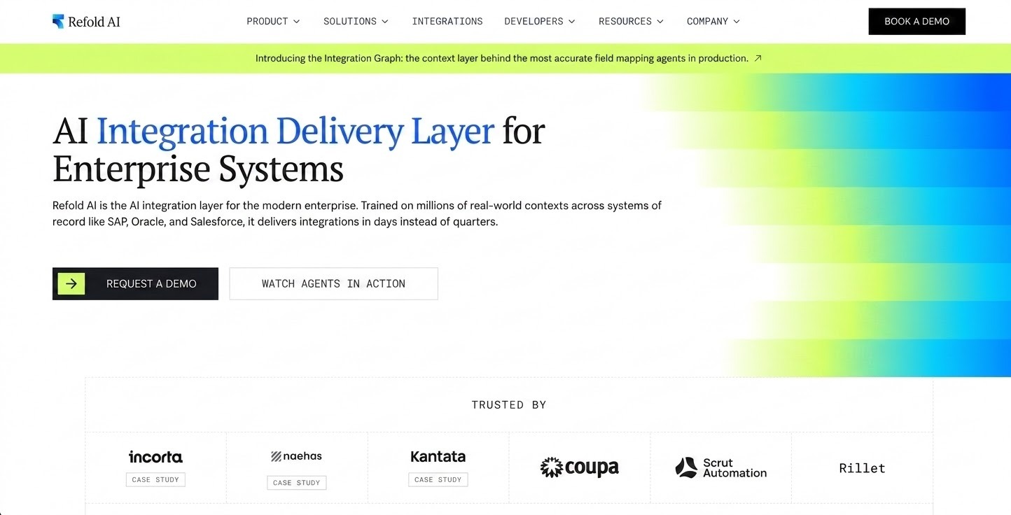
Afordable SaaS Website UX Design - Refold AI
Source: Refold AI
  • Confidence in simplicity: quiet, clean layout signals intentional restraint vs. noisy AI-product norms.
  • Homepage feels like a product preview, not a marketing brochure. Site itself acts as onboarding.
  • Frictionless curiosity loop: seeing a text transformation example makes users want to test their own.
  • Zero feature overload: one clear job, fully committed to. Bold restraint in a market full of capability lists.

18. Zingage

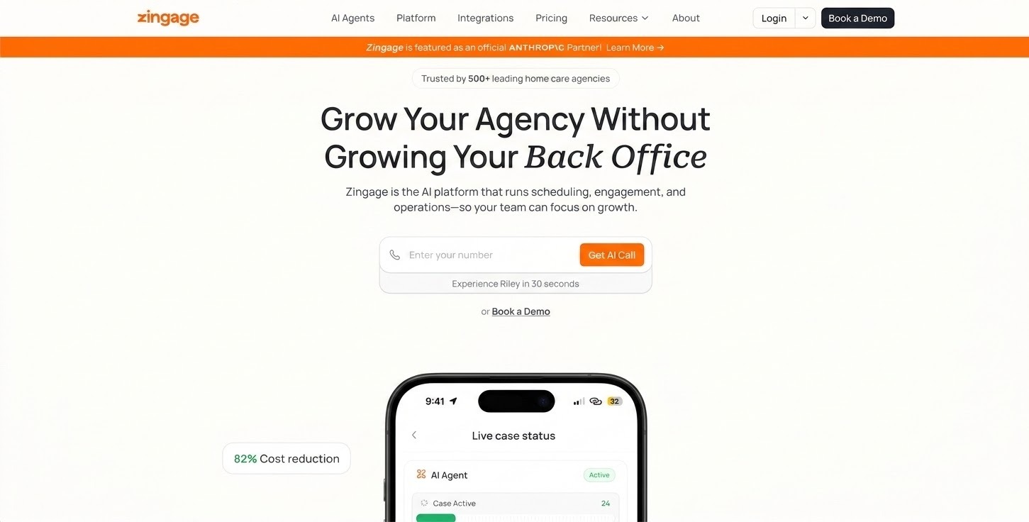
SaaS Website UX Design  - Zingage
Source: Zingage
  • Hero clearly explains what the platform does and who it is for, no vague tagline.
  • Phone number and 30-second connection promise placed right below hero, immediate trust signal.
  • Process visualization communicates operational flow (alert to resolution) without technical complexity.
  • Industry-specific focus on home care operators: narrow positioning sharpens the message.
  • Each fold has one clear message with no overloaded sections.

19. Privy

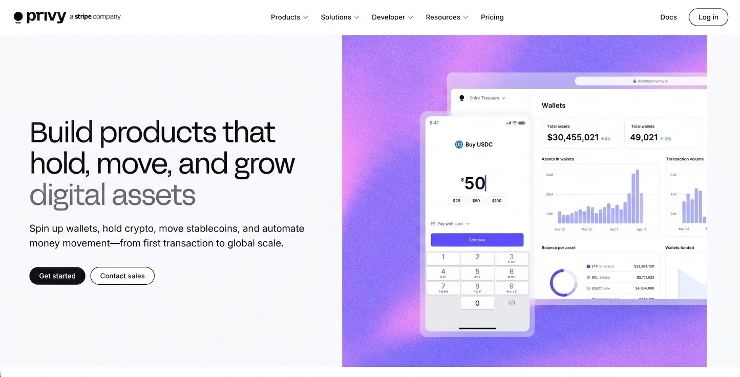
UI/UX Specialists for SaaS Products - Privy
Source: Privy
  • Hero explains product purpose in plain language, speaks to business outcomes first.
  • Product visuals look like real usage, not abstract screenshots, so users can imagine themselves inside it.
  • Benefit-focused language: outcomes (sales growth, conversion) consistently over technical capabilities.
  • CTAs repeat at sensible intervals, reinforcing value without creating fatigue.
  • Clean spacing and restrained visuals support clarity and focus.

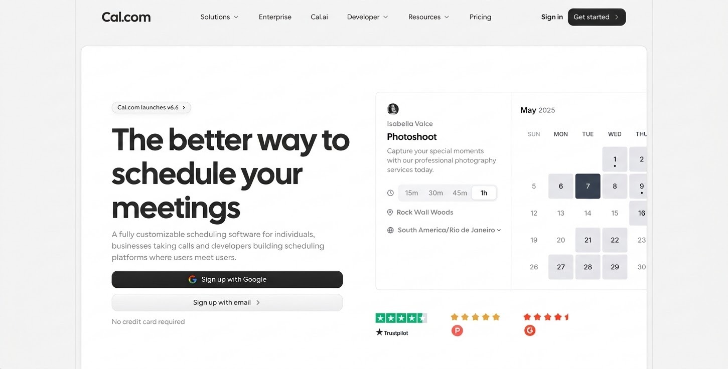
20. Cal.com

SaaS UI/UX Design Agency - Cal.com
Source: Cal.com
  • Actionable value proposition from the first fold: 'Booking and scheduling simplified', no buzzwords.
  • Non-linear information flow: users discover more value as they scroll rather than hitting a rigid feature list.
  • Action-oriented CTAs ('Try now') over educational ones ('Learn more'), nudging experience over reading.
  • Whitespace, typography, and chunked information reduce cognitive overload.
  • Design signals product maturity: stable, disciplined, not experimenting with trends.

5 UX Principles Behind High-Converting SaaS Websites

These five principles appeared consistently across the websites that converted well. They are not about aesthetics. They are about how information is structured, sequenced, and communicated.

1. Lead With Messaging Hierarchy, Not Visual Design

The hero section has one job: tell the right visitor exactly what this product does, who it is for, and what they get from it. Before any design decision is made, this message must be airtight. Write the hero copy first. Design around it. If a visitor cannot understand the product within five seconds without reading the subheadline, the messaging needs work. Supahub, Wispr Flow, and Cal.com all do this correctly. The product is understood before a single feature is described.

2. Design the Scroll as a Narrative, Not a Feature List

Map out the questions your visitor has at each point in the scroll. What do they need to believe before they will trust you? What do they need to see before they will consider converting? Structure your sections to answer those questions in sequence. Every section should make the next section easier to believe. Lattice, Intercom, and Gorgias all follow this structure: big idea, product proof, trust, then action. None of them open with a feature grid.

3. Show the Product Before You Describe It

Abstract feature cards and generic benefit statements do not convert. Real product UI does. Show visitors what they will actually see when they log in. Ramp, Mixpanel, and Intercom all use real interface screenshots in context. Cofounder and Refold AI go further by making the landing page feel like the product itself. Visitors should be able to imagine themselves inside the product before they ever click a CTA.

4. Move Trust Signals Up, Not Down

Logos and testimonials placed far down the page are invisible to most visitors. They bounce before they get there. Credibility signals need to appear near the top of the page, close to where a visitor is forming their first impression. Moveworks leads with 350+ enterprise customers early in the scroll. Mercury builds confidence through design restraint before any proof points appear. Antimetal uses impact statistics alongside feature descriptions, not after them.

5. One Primary CTA, One Clear Decision

Multiple CTAs on a single page create decision fatigue. When a visitor sees Request Demo alongside Start Free Trial alongside Learn More alongside Watch Video, they often choose none. Cal.com uses action-oriented language ('Try now') over passive educational CTAs ('Learn more'). Antimetal places 'Book a demo' at every logical entry point. Zingage puts a phone number and 30-second connection promise right below the hero. Pick the one action that matters most. Make the right next step obvious.

The Same Pattern Across Very Different Products

These principles held across tools serving completely different buyers and categories.

Pace (workplace culture) and Privy (ecommerce email) are in unrelated industries with different buyer personas. But both lead with outcomes and feeling before features. Both guide the scroll deliberately. Both make the next step obvious without applying pressure.

Kaizen Labs (a design agency) and Gorgias (customer support software) have nothing in common in terms of product. But both use the same structural logic: problem → solution → social proof → CTA. The underlying narrative architecture is identical.

That is the point. These are not category-specific tricks. They are communication principles. They work because buyers are human beings evaluating a decision, regardless of which SaaS category they are in.

What To Do With This

Before your next redesign brief, run this audit on your current website. Open your homepage and answer three questions: Can a first-time visitor explain what your product does after five seconds? Does your scroll tell a coherent story from problem to solution to proof to action? Is there one obvious next step, or several competing ones?

If you cannot answer yes to all three, you do not have a design problem yet. You have a messaging and architecture problem. Fix that first. Then design around it.

If you are working through a SaaS website redesign and want a team that starts with messaging hierarchy before touching Figma, that is exactly how we approach B2B website design at Fluidesigns. See how we work. For SaaS product teams who need the same thinking applied to product interfaces.