12 min
Product Design for Startups: What YC and VC Investors Expect
What investors actually expect from product design at funded startups. Quotes and data from Index Ventures, YC, McKinsey, and founders who raised on design.
Read More

Published
May 23, 2026
A funded B2B SaaS startup came to us with a problem that looked like a marketing issue. Traffic was healthy. The product had strong retention. But demo requests stayed flat. Their site had every trust marker you could ask for: client logos, testimonials, a clean layout. The missing piece was not credibility. It was brand perception. That gap is what separates a good-looking SaaS website from a high-converting one. Any experienced SaaS web design agency will tell you that trust markers alone do not close the conversion gap.
Most SaaS teams approach conversion optimization by stacking social proof. Add more logos. Get another G2 badge. Drop a testimonial above the fold. These are valid tactics, but they address only one dimension of the buyer's decision.
The bigger issue is what happens before a prospect reads a single word of copy. Within seconds of landing on your site, they form an impression of your company's size, maturity, and whether your product is built for someone like them. That impression is brand perception, and it operates independently of trust markers.
A SaaS website that looks like a template tells your buyer that the product behind it might be templated too.
Average B2B SaaS visitor-to-lead conversion sits between 1.5% and 2.5%, while top performers reach 8% to 15%. The gap is rarely explained by copy. The sites converting at the top end look like they belong to companies twice their size. They feel intentional, specific, and built for a defined buyer. The ones stuck at the bottom look interchangeable.
Conversion is not a single metric. It is the cumulative result of a buyer feeling progressively more confident as they move through your site. That confidence comes from three layers: trust (do I believe this company is real?), perception (does this company feel like the right fit for my problem?), and clarity (do I understand what they do and how to take the next step?).
Most SaaS website redesign conversations obsess over trust and clarity while ignoring perception entirely. But perception is the multiplier. A buyer who trusts you but perceives you as small or generic will still hesitate to book a demo, especially when competitors project more authority.
In an era where AI tools can generate a functional website in minutes, the bar for looking "professional" has dropped to zero. What AI cannot fake is a design language that communicates product depth, market understanding, and operational maturity. That is the new conversion advantage.
The founder of a B2B SaaS platform reached out because traffic was growing but demo conversions were not keeping up. Paid campaigns were driving qualified visitors. The product had solid retention. Something between the click and the CTA was breaking down.
When we audited the site, the surface-level elements were fine. Clean layout. Client logos. Feature sections. But the site felt like a generic template with their content dropped in. Zero brand personality. The design language did not match the sophistication of the product. Prospects were landing on a site that looked like dozens of other SaaS tools they had seen that week.
The trust markers were present. Testimonials, integration logos, a structured pricing page. But the overall brand perception communicated "small and unserious" despite the product being genuinely strong. The site was not lying about the product. It was underselling the company.
So we threw out the template-first approach. We rebuilt the visual identity of the marketing site to match what the product actually delivered. We stripped out generic SaaS patterns (the same hero layout, the same three-column feature grid, the same gradient backgrounds every B2B tool uses) and designed around their specific buyer journey. We restructured the information architecture so the site told a story rather than listing features.
The lesson is generalizable: when your conversion problem is not about trust or clarity, it is almost always about perception. And perception is a design problem, not a copy problem.
1. Brand Perception Is the Invisible Conversion Lever
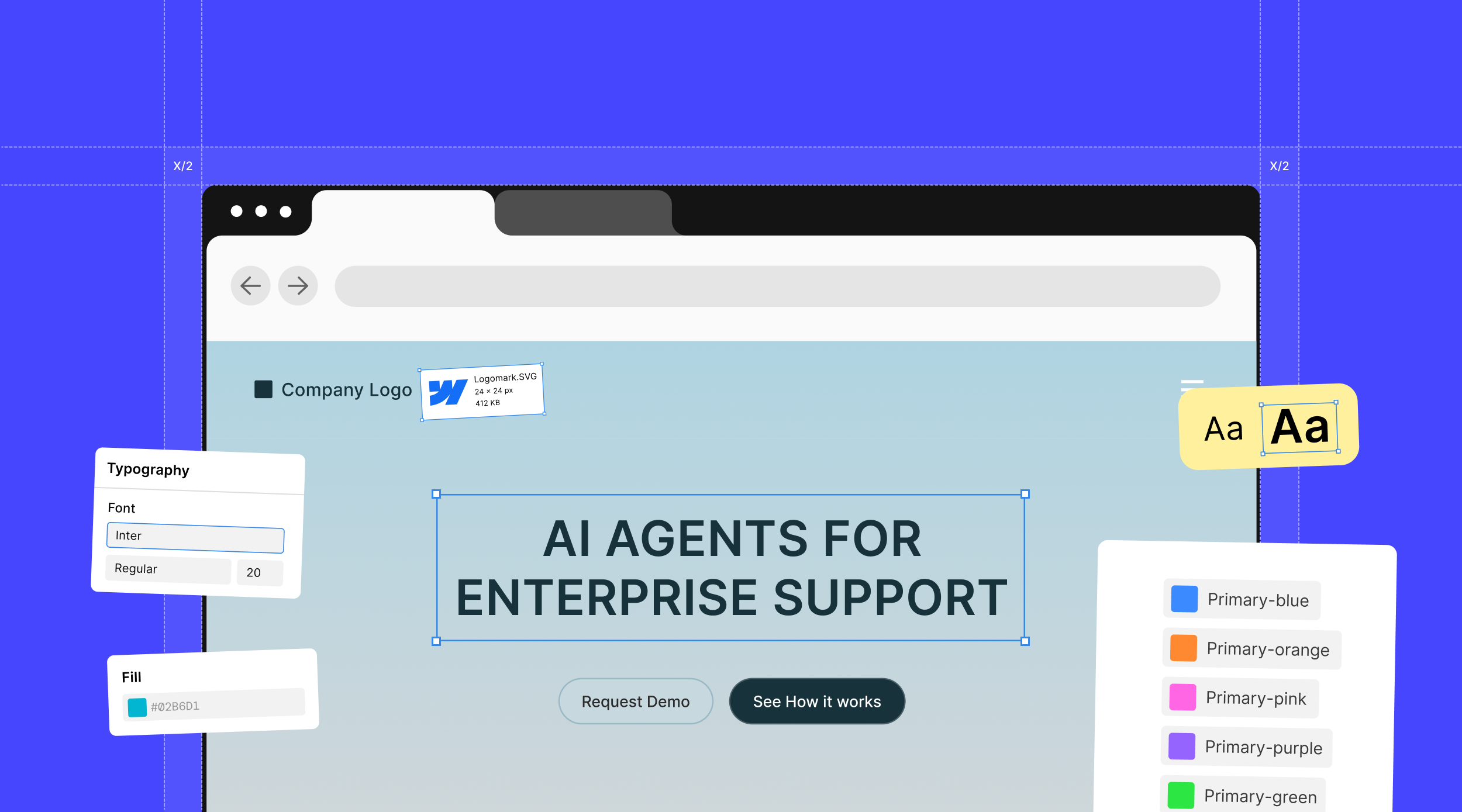
Before a prospect reads your headline, they have already judged your company by its visual presence. Typography, color confidence, whitespace, and layout sophistication form an impression that opens or closes the door to engagement. If your site looks like a Tailwind template with swapped colors, your buyer perceives commodity. A SaaS web design agency that understands this builds perception before it builds pages.
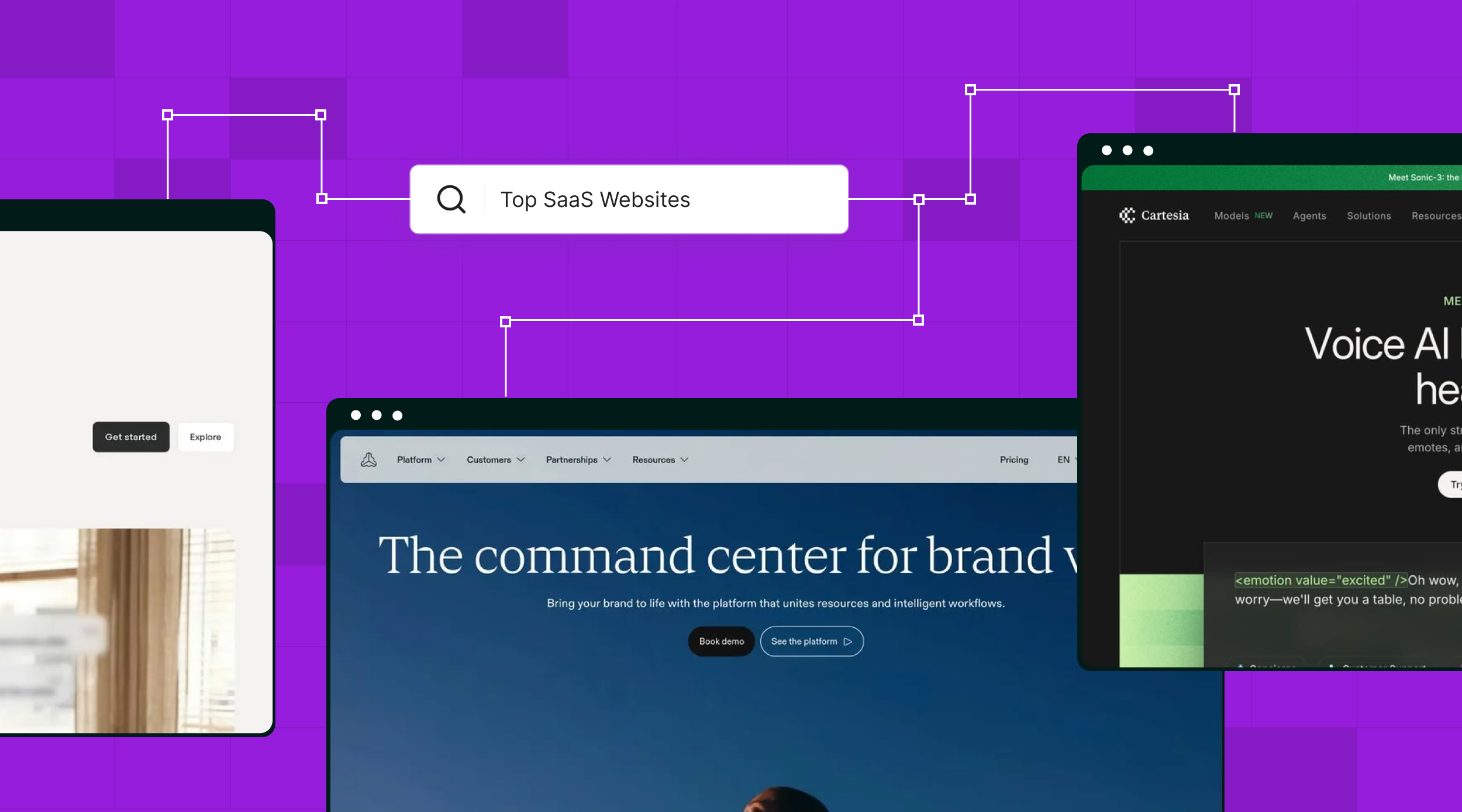
2. Kill Generic SaaS Templates and Design for Your Buyer
The three-column feature grid, the abstract gradient hero, the floating dashboard mockup: these patterns signal "SaaS company" without saying anything about YOUR SaaS company. Your buyer has seen twenty sites that look like yours this month. The conversion advantage goes to the site that feels built specifically for them, not assembled from a component library.
3. Homepage Storytelling Over Feature Listing
Your homepage is not a product spec sheet. The highest-converting SaaS homepages follow a narrative arc: name the problem, show empathy for the pain, introduce your approach, prove it works, and make the next step obvious. Feature lists belong on a dedicated features page. Your homepage should make a buyer feel understood, not informed.
4. Treat the Pricing Page as a Conversion Page
Pricing pages are among the highest-intent pages on any SaaS site. Recent benchmarks suggest pricing pages visited by qualified prospects should convert at 5% to 8%, yet most SaaS teams design them as flat comparison tables. Your pricing page needs a persuasion layer: a clear recommendation, social proof next to the decision point, and a CTA that reduces friction rather than adding it.
5. Social Proof Placement: Where, Not Just What
Most SaaS sites dump social proof into one section: a logo bar or testimonial carousel. But social proof converts best at the moment of decision, not in a dedicated "trust" section. Place client logos near pricing. Put a relevant testimonial next to each use case. Show case study results adjacent to CTAs. Context-matched proof outperforms pooled proof every time.
6. Use AI to Remove Friction, Not Just to Look Modern
The real conversion opportunity with AI in 2026 is not aesthetics. It is eliminating the friction points that make visitors leave instead of convert. Three patterns are proving this. First, an AI companion on your site that lets visitors type their specific requirement instead of scrolling through five pages to find an answer. Not every buyer wants to read your whole site. Some want to ask "do you integrate with Salesforce?" and get an instant answer. Second, AI-powered form flows for complex onboarding. Instead of forcing users through ten dropdown fields, an open text field or speech-to-text input lets them describe what they need in their own words, and the AI structures that into the data your system requires. Third, AI-driven personalization that adjusts what a returning visitor sees based on prior engagement. These are not futuristic ideas. They are conversion levers available now that most SaaS sites ignore while competitors implement them.
We worked with a smaller SaaS team whose product was strong but whose market presence was modest. After we redesigned their marketing site with a perception-first approach, something unexpected happened. At industry events, prospects who had visited the new site assumed they were a much larger company than they actually were. Conversations started differently. Buyers came to the booth expecting a serious product, not needing to be convinced of one.
That shift had nothing to do with new features, a bigger team, or more funding. It was the website doing what a high-converting SaaS website should do: making the company look exactly as good as the product actually is. When perception matches reality, the sales conversation starts further down the funnel.
You can run this yourself right now. No tools required.
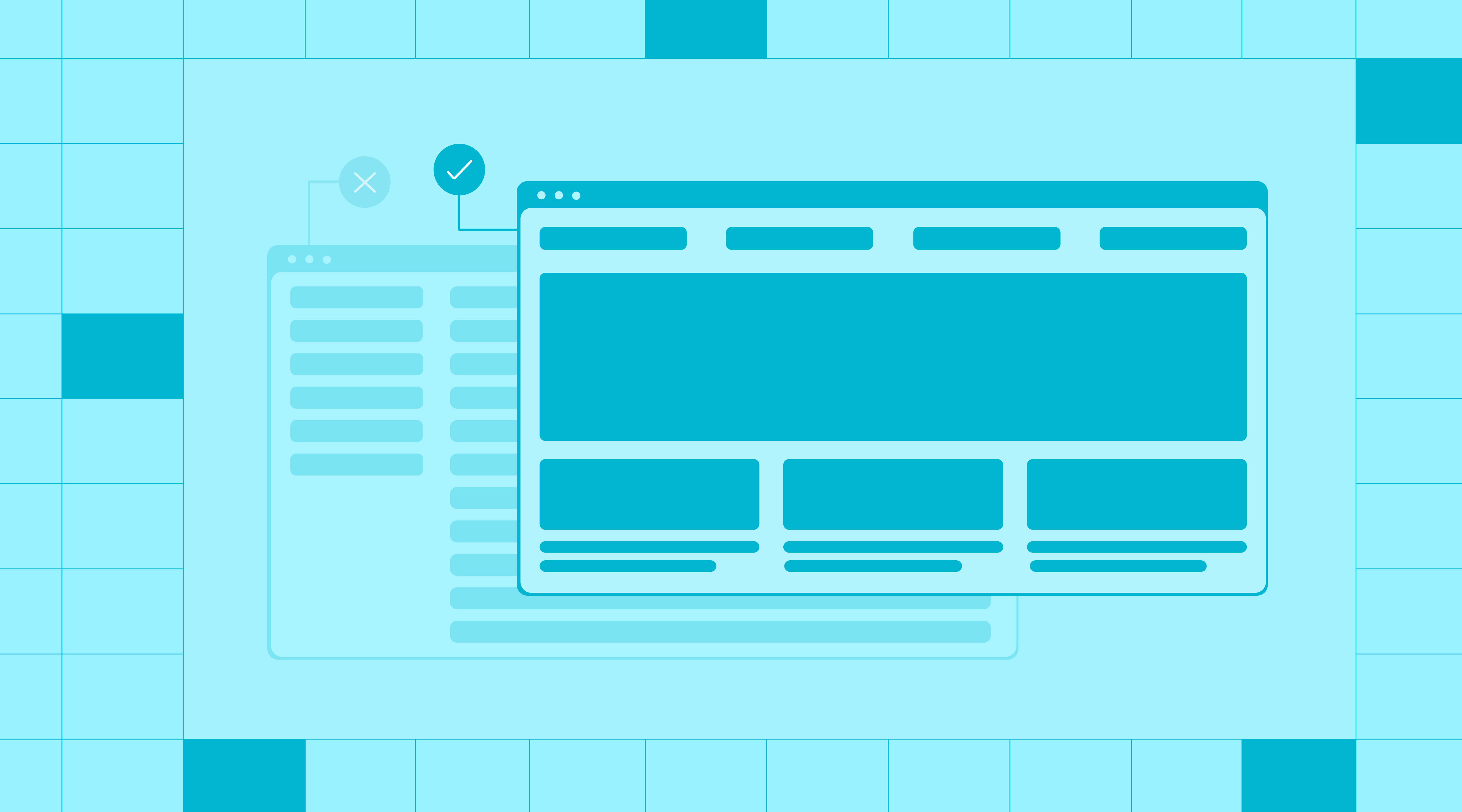
Step 1: The blind comparison test. Open your homepage and two competitor homepages. Screenshot all three and strip out logos, names, and brand colors (grayscale works). Show those screenshots to someone who has never seen your site. Ask them which company feels the most established. If they cannot tell yours apart, or rank yours lowest, your perception layer is broken.
Step 2: The 10-second recall test. Send your homepage to five people in your target buyer profile. Give them 10 seconds to look, then close the tab. Ask: what does this company do, and what is one thing you remember? If answers are vague ("something with data" or "it looked clean") and nobody recalls a specific visual, interaction, or message, your brand is invisible. A high-converting SaaS website leaves a specific impression, not a generic one.
Step 3: The product-site gap check. Open your actual product (the logged-in experience) next to your marketing site. Does the marketing site reflect the depth of what the product does? If your product handles complex workflows and advanced analytics but your site looks like a single-feature landing page, there is a perception gap your buyers feel but never articulate. They just do not book the demo.
Step 4: The friction inventory. Count the clicks from homepage to completed demo request or trial signup. Count the form fields, dropdowns, and page loads in that path. Every field beyond name, email, and company is a friction point you need to justify. If your onboarding has more than six fields, that is where AI-powered input (open text, speech-to-text) can compress the process and recover drop-offs.
Bottom line: SaaS website conversion is not a copy problem or a trust-marker problem. It is a perception problem combined with a friction problem. The sites that convert best are the ones where the design makes the company look as good as the product actually is, and where the path from interest to action has zero unnecessary steps.
If your SaaS website has traffic but is not converting, the issue might be deeper than copy or CTAs. Talk to our team about a website audit focused on brand perception and conversion design.