Oops! Something went wrong while submitting the form.
Tags
AI in Design
Good Design
SaaS
Website
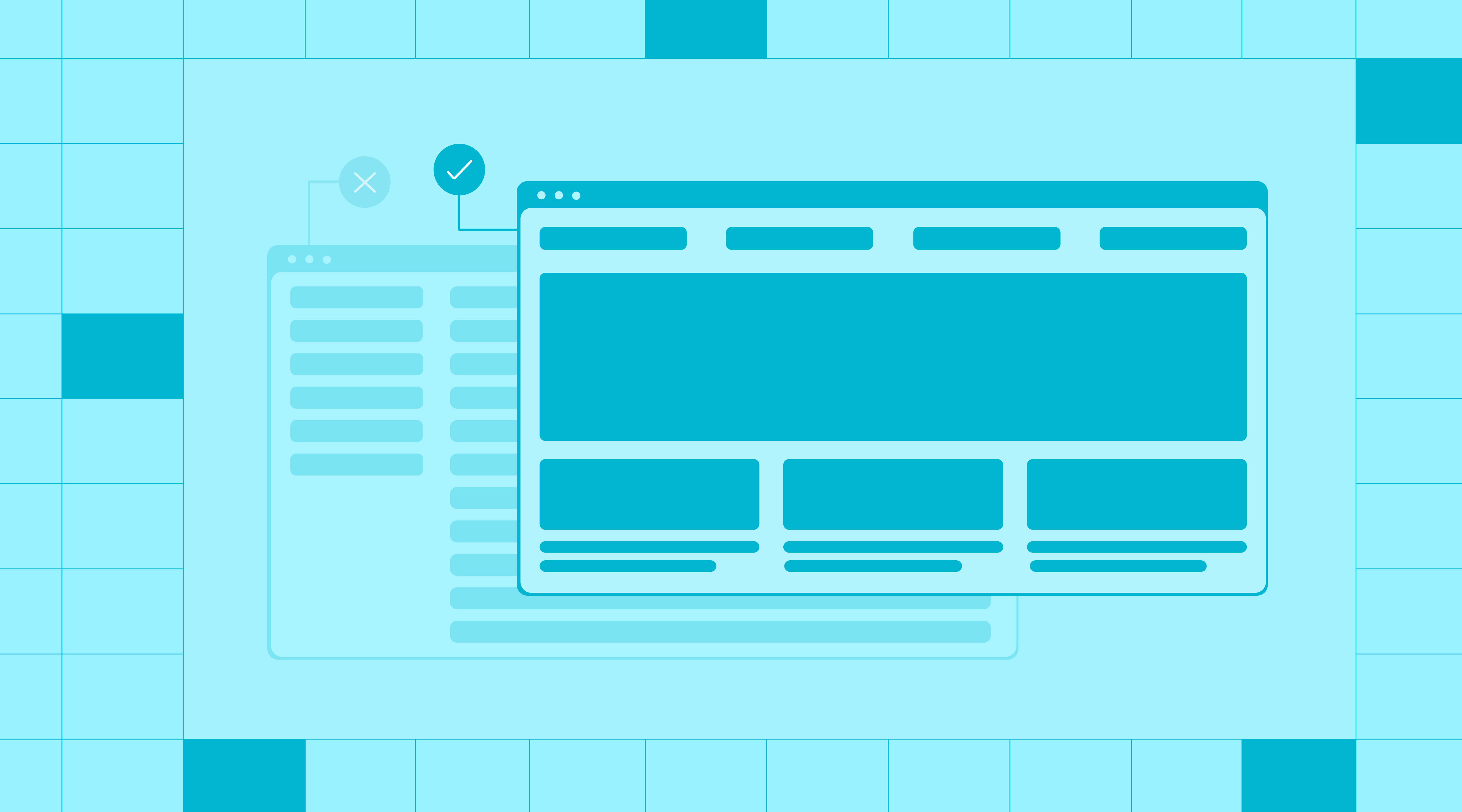
Open ten AI startup sites and you will see the same uniform. Dark hero, glowing orb, a gradient that could belong to any of them. AI SaaS visual identity has quietly become a costume that no longer fits the category.
The best AI brands left that look behind years ago. They borrow instead from research labs, magazines, and game studios. Here is the new visual language, movement by movement, and how we brought it into our own rebrand.
AI Branding Broke Out of the Software Box
For a decade, SaaS had a recognizable uniform. Blue gradients, dashboard screenshots, geometric sans-serifs, and predictable page structures. You could spot a software company from across the room.
AI broke that pattern. The most interesting AI companies stopped looking like software and started borrowing from research, publishing, gaming, scientific visualization, and internet culture. Because the technology felt new, the brands felt free to ignore the old conventions.
AI SaaS visual identity is not converging on one clean look. It is expanding into a new category built from culture, science, and technology at once.
That is the real shift, and it is why the rest of this reads as a set of distinct movements rather than a single trend. Each one is a different answer to the same question, which is how intelligence should feel.
The Movements Shaping AI SaaS Visual Identity
These are a few of the major directions we keep noticing, in the tools we use every day and in our own research. They are not a tidy or complete list. Visual language for AI is moving fast, and new directions appear faster than anyone can catalogue them.
None of these is correct on its own. The skill is knowing which one fits your product and your buyer.
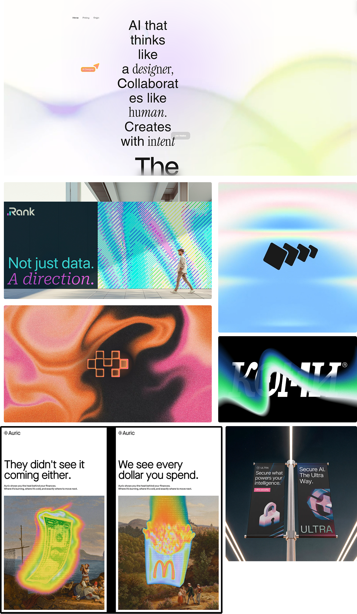
1. Machine-native, where the machine becomes the medium
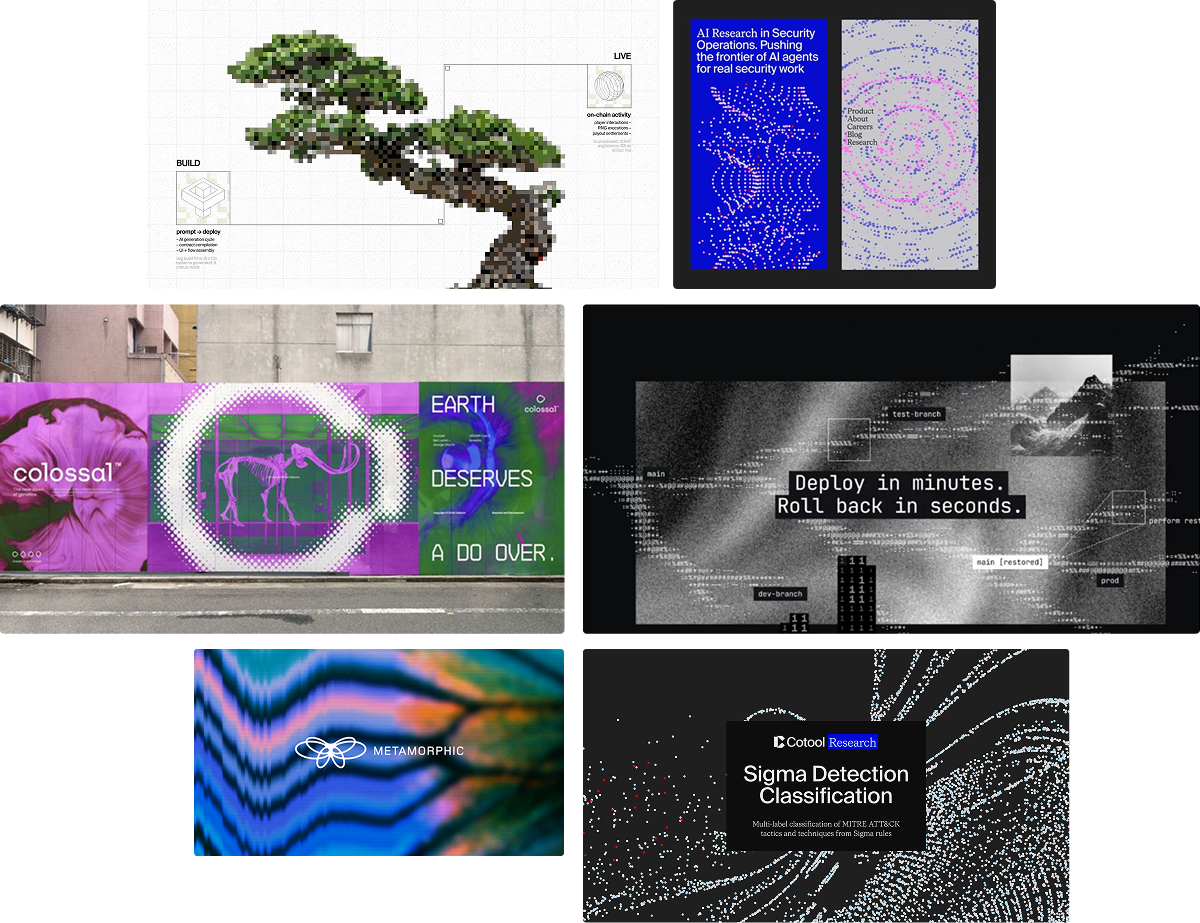
On the other end sits the machine-native look. Monospace type, ASCII forms, terminal cues, and a touch of glitch, all saying this brand lives close to the code.
Warp, the AI terminal, is a sharp lesser-known example. It keeps a terminal at the core, dark and block-based like an IDE, with a glyph that is a terminal window cracked under speed. Then it layers a warm, tactile visual system over that cold precision, which earns credibility with technical buyers without feeling sterile.
Vercel pushes the same instinct into type. Its Geist family runs a sans, a monospace, and even a pixel variant, set in a near-monochrome workspace with a single prism accent and tabular numerals that read as engineering-grade. The look is so distinctive that a wave of developer tools now copy it.
2. Painterly humanism, art doing the humanizing
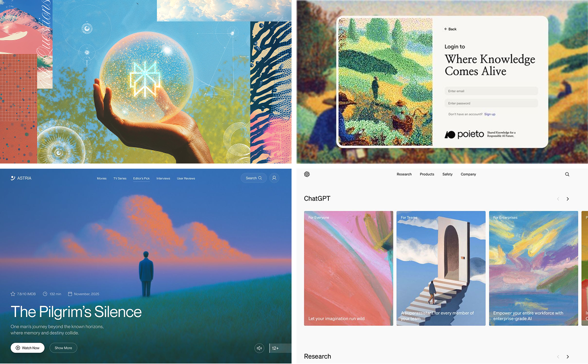
The newest turn goes all the way to fine art. Instead of diagrams or gradients, these brands reach for painting and illustration, impressionist canvases, soft atmospheric scenes, even dense collage, to make AI feel warm and human rather than mechanical.
Poieto is the sharp example. Its identity is built on pointillism, small dots resolving into an image the way data points resolve into knowledge, set behind calm editorial type so the product feels like a gallery rather than a dashboard. Others lean on hand-painted, almost spiritual scenes of a lone figure in a landscape, borrowing emotion from art history rather than software.
It is the most direct answer to the cold-machine problem. A brushstroke says made by people, for people, which is a powerful thing to claim when the worry is that AI erases the human hand.
3. Scientific beauty, where research becomes the identity
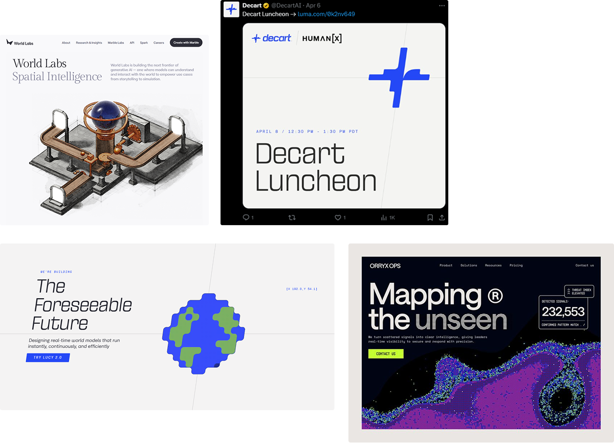
A growing set of AI brands borrow from scientific visualization. Particle systems, neural maps, molecular forms, and simulation imagery that feel closer to research than marketing.
Sakana AI shows the fresh version of this. The Tokyo lab takes its name from the word for fish and builds its identity around nature and collective intelligence, with a mark of a school of fish and one red fish swimming against the current. It frames intelligence as something that emerges from many small parts rather than one giant, glowing brain.
Colossal, the de-extinction company, shows where this look comes from. It runs an indexed, catalogue-like system with numbered navigation, DNA and CRISPR motifs, and bold editorial type that turns genetics research into a confident visual language.
It is not an AI brand, and that is the point. The strongest AI labs are borrowing the visual language of real science.
4. Editorial calm, and identities with roots
The biggest surprise is how calm the best AI brands have become. Instead of shouting, they borrow from publishing and lean on editorial type, generous whitespace, and restraint to feel considered.
Sarvam AI is the clearest fresh example. Its identity is built on a gateway, a threshold where culture and computation meet, drawn from mandala geometry into a lotus-like mark with a blue-to-orange gradient. What makes it work is restraint, signaling heritage through structure rather than decoration, so it stays rooted without copying Silicon Valley to look serious.
Wispr Flow took the same turn in its 2026 rebrand. It leaned into quiet-luxury editorial design over the clinical look common to AI startups, soft neutrals, restrained green accents, and a clean sans paired with an editorial serif for warmth. It reads considered rather than loud.
Granola, the meeting-notes tool, went further and said it out loud. When it rebranded, it admitted its old identity made it look like any other SaaS company, then rebuilt around one idea, staying a calm presence for people whose work is anything but calm.
5. Experiential futurism, the brand as an experience
For image and video tools, the identity is often the output itself. Cinematic rendering, immersive motion, volumetric depth, and interactive worlds turn the brand into a feeling you step into rather than a logo you look at.
World Labs makes the point most literally. It builds spatial, 3D worlds you can move through, so the identity is less a logo than an environment you step into. Decart does the same with real-time generated worlds, where the brand is the live, explorable output itself.
6. Post-perfection, the reaction against AI gloss
The newest move pushes back against AI-generated perfection. After a wall of flawless faces, glossy 3D, and spotless gradients, everything started to feel the same.
So designers began breaking it on purpose. Grain, glitch, broken grids, pixel artifacts, and messy type, the aesthetic some call glitchmaxxing. Its appeal is honesty, because a little imperfection reads as human and intentional in a sea of synthetic polish.
Rabbit is the friendly face of it. Its device, designed with Teenage Engineering, is a squat orange object with a Tamagotchi spirit and a pixel-art mascot, retro and tactile on purpose. Teenage Engineering's whole philosophy, funky and hands-on and a little imperfect, is exactly what this look borrows from.
A few things cut across all of them. The strongest brands create a feeling around intelligence rather than illustrating it literally, they lean on restraint to look confident, and they treat experimentation as a feature rather than a risk.
None of this stands still either. What looks fresh now becomes the next default, which is exactly why the real work is choosing deliberately rather than chasing the latest look.
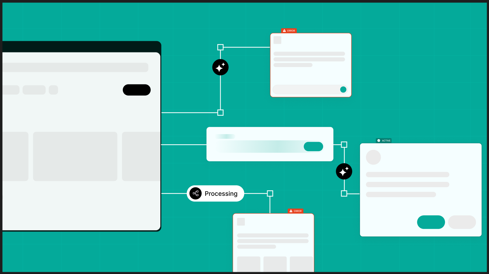
How We Brought This Into Our Own Rebrand
We did not write this as outside observers. We rebuilt our own identity around the same shift, which is the only reason we trust these observations.
Working across SaaS and AI products, we kept seeing these movements show up in the brands we admired, so we put the thinking to the test on ourselves first.
Our previous identity did its job well for years. But the ground shifted under it. As AI reset what design could look like, our brand needed to feel aligned with this generation of aesthetics rather than the one before.
So we pulled from the movements we admire. ASCII forms and pixel graphics from the machine-native world, fluid gradients for warmth and motion, and a touch of glitch for energy.
The first version went too far. The glitch and noise started to read as a costume rather than a point of view, and the energy was there but the confidence was not.
The turning point was pulling it back into an editorial frame. White backgrounds, airy layouts, and a deliberate type pairing to hold the experimentation in place.
We chose FK Raster, a pixelated serif, to carry the machine character, and set it against Area Normal, a clean neutral sans, for calm and legibility. FK Raster comes from the same independent type world a lot of new AI brands now draw from, which is part of why the pairing feels current rather than costume.
The lesson is the one running through every brand above. The strongest AI identities borrow boldly, then edit ruthlessly. Restraint is what turns a pile of references into a language.
The Same Thinking, in Client Work
The clearest test of all this is client work, not our own brand. We saw it on the State of AI Adoption report we designed for Elevation Capital.
The challenge with a report like that is making dense survey data feel like something people actually want to read. A wall of percentages and charts is easy to ignore, and most market reports look exactly the part.
So we built it as an AI-native experience rather than a slide deck dressed up for the web. An ASCII-driven hero, blue and purple gradients, big animated data highlights, and a narrative that walks through the findings instead of dumping them on the page.
The result feels current and credible at once, which is exactly what a report about AI should feel like. The visual language does the arguing before a single statistic loads.
Where This Leaves You
If your AI brand still looks like 2018 SaaS, the fix is not more polish. It is a decision about which of these worlds you want to belong to.
Pick the movement that fits your product and your buyer. Borrow from it with conviction, then edit until only the strong parts remain.
A quick test helps. Put your hero section beside five competitors with the logos hidden, and if a buyer cannot tell you apart, the identity is doing none of its job.
Bottom line. AI SaaS visual identity has become its own category, built from editorial design, science, gaming, and culture rather than the old software playbook. The brands that win are choosing a language on purpose.
If you are rebuilding an AI product and want an identity that leads its category instead of blending into it, that is the work our AI product design team does every day.


.png)
.png)
.png)
.png)